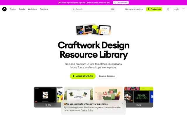
Preview image. Unlock full-res
Crisp paper on a clean desk. A light, airy workspace where bold black text and electric lime accents pop against pristine whites and soft grays, creating an impression of organized creativity.
Color palette
Primary calls to action, active navigation indicators, `Pro Access` buttons – a burst of energy against the monochromatic base.
Accent color used for specific categories or decorative elements.
Indicator icons, smaller accent elements – adding a vibrant, playful touch without shifting focus from the primary lime accent.
Used for specific iconography or decorative effects, providing a cool contrast.
Subtle background overlay, creating a soft, ethereal light from above.
Subtle background overlay, radiating a gentle light from the side.
Subtle background overlay, creating a soft, localized glow.
Primary text, headings, icons, borders, prominent interactive elements.
Page backgrounds, card surfaces, button backgrounds, primary UI elements.
Secondary text, subtle icons, inactive navigation items, button text.
Tertiary text, less prominent icons, supporting details.
Subtle background for grouped elements, card backgrounds, light surface differentiation.
Alternate background for sections, minor surface differentiation.
Faint borders, subtle button backgrounds, UI dividers.
Error or notice text, drawing attention to critical information.
Typography
- Weights
- 400, 500, 600, 700
- Sizes
- 11px, 12px, 14px, 15px, 16px, 18px, 20px, 22px, 24px, 32px, 36px, 42px, 62px, 72px
- Line height
- 1, 1.06, 1.1, 1.13, 1.14, 1.17, 1.22, 1.27, 1.3, 1.33, 1.38, 1.43, 1.44, 1.45, 1.5, 1.83
- Letter spacing
- -0.0690em at 72px, -0.0500em at 62px, -0.0400em at 42px, -0.0300em at 36px, -0.0270em at 32px, -0.0200em at 24px, -0.0180em at 22px, -0.0160em at 20px, -0.0070em at 18px
- Fallback
- Inter
Used for all text elements. The extensive weight and size range, combined with specific negative letter spacing for larger sizes, ensures readability at smaller scales while providing a distinct, tightly spaced, and impactful presence for headlines. This custom font contributes significantly to the brand's sharp, modern feel.
Spacing & shape
Elevation
Components
Text: Pitch Black (#000000), Euclid Circular A, 16px, weight 500, lineHeight 1.5. Hover effect: color changes to Pitch Black (#000000).
Background: Cloud White (#ffffff). Text: Slate Gray (#606060). Border: rgba(0, 0, 0, 0.1) 1px solid. Radius: 10px. Padding: 5px. Type: Euclid Circular A, 16px, weight 400.
Background: Electric Lime (#cafc00). Text: Pitch Black (#000000). Border: rgba(0, 0, 0, 0.1) 1px solid. Radius: 10px. Padding: 5px. Type: Euclid Circular A, 16px, weight 600.
Background: transparent. Text: Pitch Black (#000000). No border. Radius: 0px. No padding. Type: Euclid Circular A, 16px, weight 400.
Background: Cloud White (#ffffff) or Whisper Gray (#f9f9f9). Text: Pitch Black (#000000). Border: rgba(0, 0, 0, 0.1) 1px solid or none. Radius: 9999px. Padding: 14px 12.5px. Shadow: inset rgba(47, 43, 67, 0.1) 0px -1px 0px 0px, rgba(47, 43, 67, 0.1) 0px 1px 3px 0px for elevated ones. Type: Euclid Circular A, 16px, weight 500.
Background: Whisper Gray (#f9f9f9). Radius: 10px. No shadow. No padding inside the card. Contains an image and text. Text: Pitch black, 20px, weight 500.
Background: transparent. Text: Pitch Black (#000000). Border Bottom: 1px solid Pitch Black (#000000). No border radius. Placeholder text: Slate Gray (#606060). Type: Euclid Circular A, 16px, weight 400.
Background: Cloud White (#ffffff). Radius: 10px. Shadow: rgba(0, 0, 0, 0.05) 0px 0px 0px 1px, rgba(0, 0, 0, 0.2) 0px 5px 10px 0px. Text: Pitch Black (#000000) for primary, Slate Gray (#606060) for links. Type: Euclid Circular A, 14px, weight 400.
Guidelines
- Prioritize Pitch Black (#000000) for all significant text and headings to ensure maximum visual impact and contrast against light backgrounds.
- Utilize Electric Lime (#cafc00) exclusively for primary calls to action, active states, and key 'Pro Access' indicators.
- Apply Euclid Circular A with specific negative letter-spacing values (-0.0690em for 72px headlines, down to -0.0070em for 18px body text) as defined in the typography section, to maintain the brand's tight typesetting.
- Use a border-radius of 9999px for call-out buttons, tags, or small interactive elements to create a distinct pill shape.
- Employ the subtle charcoal-tinted shadows (rgba(47, 43, 67, 0.1) for inset 0px -1px 0px 0px and 0px 1px 3px 0px) to indicate clickable or interactive surfaces without heavy visual weight.
- Use Cloud White (#ffffff) and Whisper Gray (#f9f9f9) for surface backgrounds, clearly delineating content blocks while retaining an airy feel.
- Do not introduce new saturated primary colors; limit the palette to Electric Lime (#cafc00), Fuchsia Burst (#df04e3), and Violet Splash (#c42df9) for accenting.
- Avoid using heavy drop shadows for elevation; instead, use the subtle rgba(47, 43, 67, 0.1) charcoal-tinted shadows or slight background color shifts like Whisper Gray (#f9f9f9) on Cloud White (#ffffff).
- Do not use generic system fonts; always specify Euclid Circular A with its defined weights and letter spacing.
- Refrain from using square or overly sharp corners for interactive elements where a 10px or 9999px radius is established as a pattern.
- Do not use the Electric Lime (#cafc00) for non-interactive content or purely decorative elements; reserve its use for actionable items.
About this system
ShowHide
This system projects an organized, creatively fertile atmosphere. Dominant crisp white backgrounds allow bold black typography to stand out, reminiscent of ink on paper. Subtle charcoal-tinted shadows lift elements just enough to define hierarchy without visual weight. The only saturated hue, vibrant lime green, serves as a focused accent, guiding user interaction like a highlighter on a blueprint, while soft, organic radial gradients add a touch of playful depth.
The page uses a maximum width containment for most content, centered on a Cloud White background, creating a spacious and structured feel. The hero section is a centered stack of a large headline, subtext, and prominent CTA buttons, usually featuring a product visualization above it. Sections follow a consistent vertical rhythm with ample spacing (e.g., inferred 'sectionGap' of 64px or more). Content is primarily arranged in centered stacks, or in clear two-column visual arrangements where text is to one side and imagery/cards to the other. Card grids (e.g., for categories or testimonials) typically appear in a flexible multi-column layout, adapting to screen size. The header is a sticky top bar with a search input, navigation, and 'Pro Access' CTA, while secondary navigation features pill-shaped category filters, further reinforcing the organized toolkit metaphor.
The visual language focuses on product visualization through high-quality, illustrative screenshots and product photography, often displayed within mockups (e.g., tablets, phones, monitors). These are typically contained within card-like structures, sometimes with soft rounded corners (10px). Illustrations are flat or slightly dimensional, using a mix of brand colors and neutrals, acting as decorative elements or supporting explanatory content. Icons are outline or filled, using Pitch Black or Slate Gray, with occasional Violet Splash accents. Imagery is not full-bleed but carefully placed to showcase design assets, contributing to the site's function as a resource library rather than a storytelling platform. The density is balanced, allowing both visuals and text to breathe.
Reminiscent of Figma, Linear, Unsplash, SavvyCal, Canva.
# Craftwork — Style Reference
> Crisp paper on a clean desk. A light, airy workspace where bold black text and electric lime accents pop against pristine whites and soft grays, creating an impression of organized creativity.

**Theme:** light

**Site:** https://craftwork.design

This system projects an organized, creatively fertile atmosphere. Dominant crisp white backgrounds allow bold black typography to stand out, reminiscent of ink on paper. Subtle charcoal-tinted shadows lift elements just enough to define hierarchy without visual weight. The only saturated hue, vibrant lime green, serves as a focused accent, guiding user interaction like a highlighter on a blueprint, while soft, organic radial gradients add a touch of playful depth.

## Tokens — Colors

| Name | Value | Token | Role |
|------|------|------|------|
| Electric Lime | `#cafc00` | `--color-electric-lime` | Primary calls to action, active navigation indicators, `Pro Access` buttons – a burst of energy against the monochromatic base. |
| Fuchsia Burst | `#df04e3` | `--color-fuchsia-burst` | Accent color used for specific categories or decorative elements. |
| Violet Splash | `#c42df9` | `--color-violet-splash` | Indicator icons, smaller accent elements – adding a vibrant, playful touch without shifting focus from the primary lime accent. |
| Sky Blue | `#53c1de` | `--color-sky-blue` | Used for specific iconography or decorative effects, providing a cool contrast. |
| Meadow Glow Top | `#b4eba0` | `--color-meadow-glow-top` | Subtle background overlay, creating a soft, ethereal light from above. |
| Meadow Glow Side | `#b4eba0` | `--color-meadow-glow-side` | Subtle background overlay, radiating a gentle light from the side. |
| Meadow Glow Center | `#c8faBE` | `--color-meadow-glow-center` | Subtle background overlay, creating a soft, localized glow. |
| Pitch Black | `#000000` | `--color-pitch-black` | Primary text, headings, icons, borders, prominent interactive elements. |
| Cloud White | `#ffffff` | `--color-cloud-white` | Page backgrounds, card surfaces, button backgrounds, primary UI elements. |
| Slate Gray | `#606060` | `--color-slate-gray` | Secondary text, subtle icons, inactive navigation items, button text. |
| Ash Gray | `#999999` | `--color-ash-gray` | Tertiary text, less prominent icons, supporting details. |
| Whisper Gray | `#f9f9f9` | `--color-whisper-gray` | Subtle background for grouped elements, card backgrounds, light surface differentiation. |
| Smoke Gray | `#f2f2f2` | `--color-smoke-gray` | Alternate background for sections, minor surface differentiation. |
| Silver Mist | `#dee0e3` | `--color-silver-mist` | Faint borders, subtle button backgrounds, UI dividers. |
| Warning Orange | `#f54911` | `--color-warning-orange` | Error or notice text, drawing attention to critical information. |

## Tokens — Typography

### Euclid Circular A
- **Substitute:** Inter
- **Weights:** 400, 500, 600, 700
- **Sizes:** 11px, 12px, 14px, 15px, 16px, 18px, 20px, 22px, 24px, 32px, 36px, 42px, 62px, 72px
- **Line height:** 1, 1.06, 1.1, 1.13, 1.14, 1.17, 1.22, 1.27, 1.3, 1.33, 1.38, 1.43, 1.44, 1.45, 1.5, 1.83
- **Letter spacing:** -0.0690em at 72px, -0.0500em at 62px, -0.0400em at 42px, -0.0300em at 36px, -0.0270em at 32px, -0.0200em at 24px, -0.0180em at 22px, -0.0160em at 20px, -0.0070em at 18px
- **Role:** Used for all text elements. The extensive weight and size range, combined with specific negative letter spacing for larger sizes, ensures readability at smaller scales while providing a distinct, tightly spaced, and impactful presence for headlines. This custom font contributes significantly to the brand's sharp, modern feel.

## Tokens — Type Scale

| Role | Size | Line height | Letter spacing |
|------|------|------|------|
| caption | 11px | 1.44 | — |
| heading | 18px | 1.44 | -0.007em |
| heading-lg | 22px | 1.27 | -0.018em |
| display-sm | 32px | 1.13 | -0.027em |
| display-md | 42px | 1.14 | -0.04em |
| display | 62px | 1.06 | -0.05em |
| display-lg | 72px | 1 | -0.069em |

## Tokens — Spacing

- **Section gap:** 64px
- **Card padding:** 14px
- **Element gap:** 4px

## Tokens — Radius

- **Buttons:** 10px, 9999px
- **Inputs:** 0px
- **Cards:** 10px, 33px, 9999px

## Tokens — Elevation

- **Card/Button (Subtle Lift):** `inset rgba(47, 43, 67, 0.1) 0px -1px 0px 0px, rgba(47, 43, 67, 0.1) 0px 1px 3px 0px`
- **Cookie Consent Banner:** `rgba(0, 0, 0, 0.05) 0px 0px 0px 1px, rgba(0, 0, 0, 0.2) 0px 5px 10px 0px`

## Layout

The page uses a maximum width containment for most content, centered on a Cloud White background, creating a spacious and structured feel. The hero section is a centered stack of a large headline, subtext, and prominent CTA buttons, usually featuring a product visualization above it. Sections follow a consistent vertical rhythm with ample spacing (e.g., inferred 'sectionGap' of 64px or more). Content is primarily arranged in centered stacks, or in clear two-column visual arrangements where text is to one side and imagery/cards to the other. Card grids (e.g., for categories or testimonials) typically appear in a flexible multi-column layout, adapting to screen size. The header is a sticky top bar with a search input, navigation, and 'Pro Access' CTA, while secondary navigation features pill-shaped category filters, further reinforcing the organized toolkit metaphor.

## Imagery

The visual language focuses on product visualization through high-quality, illustrative screenshots and product photography, often displayed within mockups (e.g., tablets, phones, monitors). These are typically contained within card-like structures, sometimes with soft rounded corners (10px). Illustrations are flat or slightly dimensional, using a mix of brand colors and neutrals, acting as decorative elements or supporting explanatory content. Icons are outline or filled, using Pitch Black or Slate Gray, with occasional Violet Splash accents. Imagery is not full-bleed but carefully placed to showcase design assets, contributing to the site's function as a resource library rather than a storytelling platform. The density is balanced, allowing both visuals and text to breathe.

## Components

### CTA Button Group

### Filter Pill Tags

### Testimonial Cards

### Primary Navigation Link
*Navigational elements in the top bar.*

Text: Pitch Black (#000000), Euclid Circular A, 16px, weight 500, lineHeight 1.5. Hover effect: color changes to Pitch Black (#000000).

### Tertiary Ghost Button
*Subtle action buttons, often alongside primary actions.*

Background: Cloud White (#ffffff). Text: Slate Gray (#606060). Border: rgba(0, 0, 0, 0.1) 1px solid. Radius: 10px. Padding: 5px. Type: Euclid Circular A, 16px, weight 400.

### Prominent CTA Button
*Primary calls to action with strong visual emphasis.*

Background: Electric Lime (#cafc00). Text: Pitch Black (#000000). Border: rgba(0, 0, 0, 0.1) 1px solid. Radius: 10px. Padding: 5px. Type: Euclid Circular A, 16px, weight 600.

### Text Link Button
*In-line actions or simple clickable text without a distinct background.*

Background: transparent. Text: Pitch Black (#000000). No border. Radius: 0px. No padding. Type: Euclid Circular A, 16px, weight 400.

### Pill Button
*Filter tags or category selection, emphasizing choice.*

Background: Cloud White (#ffffff) or Whisper Gray (#f9f9f9). Text: Pitch Black (#000000). Border: rgba(0, 0, 0, 0.1) 1px solid or none. Radius: 9999px. Padding: 14px 12.5px. Shadow: inset rgba(47, 43, 67, 0.1) 0px -1px 0px 0px, rgba(47, 43, 67, 0.1) 0px 1px 3px 0px for elevated ones. Type: Euclid Circular A, 16px, weight 500.

### Category Filter Card
*Cards for displaying different categories of assets.*

Background: Whisper Gray (#f9f9f9). Radius: 10px. No shadow. No padding inside the card. Contains an image and text. Text: Pitch black, 20px, weight 500.

### Search Input Field
*User input for search queries.*

Background: transparent. Text: Pitch Black (#000000). Border Bottom: 1px solid Pitch Black (#000000). No border radius. Placeholder text: Slate Gray (#606060). Type: Euclid Circular A, 16px, weight 400.

### Cookie Consent Banner
*Notifying users about cookie usage.*

Background: Cloud White (#ffffff). Radius: 10px. Shadow: rgba(0, 0, 0, 0.05) 0px 0px 0px 1px, rgba(0, 0, 0, 0.2) 0px 5px 10px 0px. Text: Pitch Black (#000000) for primary, Slate Gray (#606060) for links. Type: Euclid Circular A, 14px, weight 400.

## Guidelines

### Do

- Prioritize Pitch Black (#000000) for all significant text and headings to ensure maximum visual impact and contrast against light backgrounds.
- Utilize Electric Lime (#cafc00) exclusively for primary calls to action, active states, and key 'Pro Access' indicators.
- Apply Euclid Circular A with specific negative letter-spacing values (-0.0690em for 72px headlines, down to -0.0070em for 18px body text) as defined in the typography section, to maintain the brand's tight typesetting.
- Use a border-radius of 9999px for call-out buttons, tags, or small interactive elements to create a distinct pill shape.
- Employ the subtle charcoal-tinted shadows (rgba(47, 43, 67, 0.1) for inset 0px -1px 0px 0px and 0px 1px 3px 0px) to indicate clickable or interactive surfaces without heavy visual weight.
- Use Cloud White (#ffffff) and Whisper Gray (#f9f9f9) for surface backgrounds, clearly delineating content blocks while retaining an airy feel.

### Don't

- Do not introduce new saturated primary colors; limit the palette to Electric Lime (#cafc00), Fuchsia Burst (#df04e3), and Violet Splash (#c42df9) for accenting.
- Avoid using heavy drop shadows for elevation; instead, use the subtle rgba(47, 43, 67, 0.1) charcoal-tinted shadows or slight background color shifts like Whisper Gray (#f9f9f9) on Cloud White (#ffffff).
- Do not use generic system fonts; always specify Euclid Circular A with its defined weights and letter spacing.
- Refrain from using square or overly sharp corners for interactive elements where a 10px or 9999px radius is established as a pattern.
- Do not use the Electric Lime (#cafc00) for non-interactive content or purely decorative elements; reserve its use for actionable items.

## Agent Prompt Guide

### Quick Color Reference
- Text: `Pitch Black (#000000)`
- Background: `Cloud White (#ffffff)`
- CTA: `Electric Lime (#cafc00)`
- Border: `Silver Mist (#dee0e3)`
- Secondary Text: `Slate Gray (#606060)`

### Example Component Prompts
1. **Create a hero section:** White background. Headline 'Craftwork Design Resource Library' at 72px 'Euclid Circular A' weight 700, Pitch Black (#000000), letter-spacing -0.069em. Subtext 'Free and premium UI kits, templates, illustrations, icons, fonts, and mockups in one place.' at 20px 'Euclid Circular A' weight 400, Pitch Black (#000000). Buttons 'Unlock all with Pro' (Electric Lime #cafc00 background, Pitch Black #000000 text, 10px radius, 5px padding, 1px rgba(0,0,0,0.1) border, 16px font weight 600) and 'Explore Catalog' (Cloud White #ffffff background, Slate Gray #606060 text, 10px radius, 5px padding, 1px rgba(0,0,0,0.1) border, 16px font weight 400).
2. **Generate a testimonial card:** Cloud White (#ffffff) background, 9999px radius, with shadow 'inset rgba(47, 43, 67, 0.1) 0px -1px 0px 0px, rgba(47, 43, 67, 0.1) 0px 1px 3px 0px'. Padding 14px 12.5px. Inside, use a small avatar followed by body text 'I am fond of Craftwork - the most powerful team I've ever seen.' in Pitch Black (#000000) 16px Euclid Circular A weight 400, then author name 'Azamat Ivanov' in Slate Gray (#606060) 14px weight 500.
3. **Design a category filter pill:** Whisper Gray (#f9f9f9) background, 9999px radius. Text 'UI Kits' in Pitch Black (#000000) 16px Euclid Circular A weight 500. Padding 14px 12.5px. Include the subtle lift shadow style for interactive filters.
4. **Create a search input field:** Transparent background with a 1px solid Pitch Black (#000000) bottom border. Placeholder text 'Search' in Slate Gray (#606060) 16px Euclid Circular A weight 400. Text input color Pitch Black (#000000).
More like this







Keep what you find
A free account saves references to boards and can send you a weekly email of picks based on what you save.
To see every result, go Pro.