Preview image. Unlock full-res
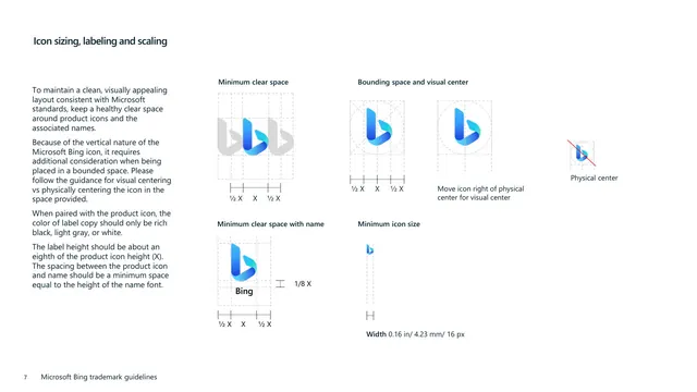
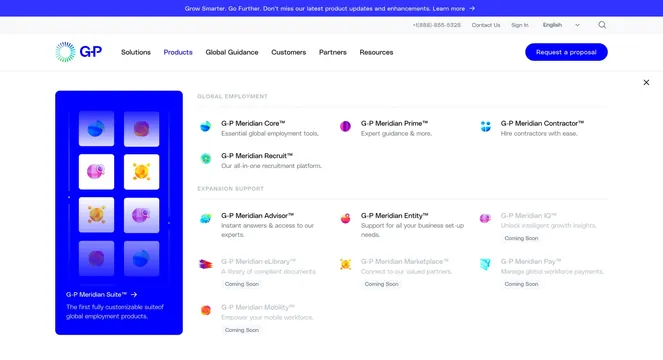
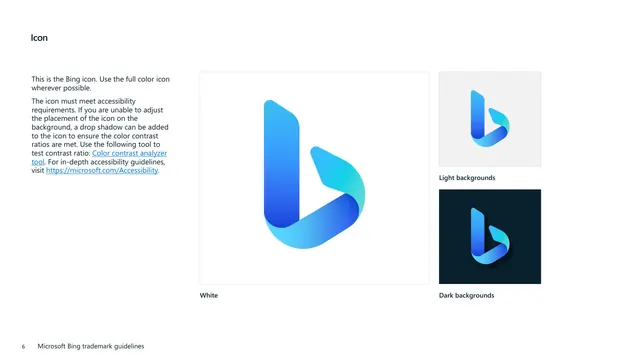
White page presenting the gradient blue Bing "b" icon large on white plus smaller swatches on light and dark backgrounds, with accessibility guidance.
Summary
The icon page, showing the gradient blue folded "b" Bing symbol at large scale on white and at smaller scale on light and dark grounds, with notes on meeting accessibility contrast.
Visual description
White background with a bold "Icon" heading top-left and a left-column note that this is the Bing icon, the full color version should be used wherever possible, and the icon must meet accessibility requirements, with two blue underlined links (a color contrast analyzer tool and the Microsoft Accessibility site) and mention that a drop shadow can be added to ensure contrast. The right side holds a large bordered white panel containing the gradient blue-to-cyan folded "b" icon, captioned "White." To its right are two smaller stacked swatches: the icon on a light gray panel captioned "Light backgrounds," and the icon with a subtle drop shadow on a dark navy panel captioned "Dark backgrounds." A footer with page number "6" sits bottom-left.
Key takeaway
Anchoring the page with one oversized hero rendering of the icon, then demoting the background-variant tests to small supporting swatches, creates clear hierarchy. Calling out accessibility explicitly, linking a contrast tool, and showing the drop-shadow fallback for dark grounds is a responsible, copyable detail.
Reuse notes
A clean template for the product-icon or app-icon page of a brand guide, especially for a colorful gradient mark that needs contrast care across backgrounds. The big-hero-plus-small-variants split reads well at a glance. Including the accessibility tool link and the drop-shadow exception preempts common misuse on busy or dark backgrounds.