Preview image. Unlock full-res
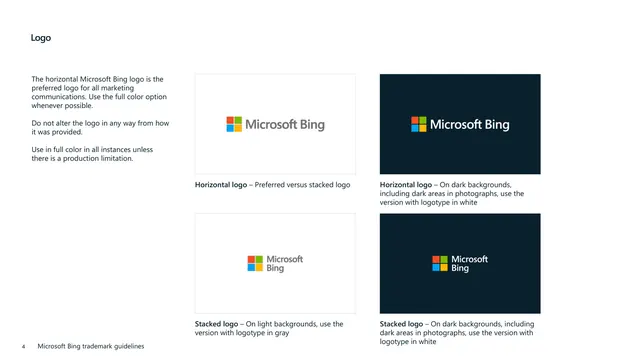
Four-swatch white page showing the horizontal and stacked Microsoft Bing logos on light and dark backgrounds with captioned usage rules.
Summary
A logo-usage page that demonstrates the horizontal and stacked Microsoft Bing lockups on both light and dark backgrounds, with rules for which color treatment to use where.
Visual description
White background with a bold "Logo" heading top-left and a three-paragraph left column stating the horizontal logo is preferred for marketing, the logo must not be altered, and full color should be used unless production limits prevent it. The right side holds a two-by-two grid of bordered swatches. Top row: the horizontal logo (four-square mark plus grey wordmark) on a white panel, and the same horizontal logo with a white wordmark on a navy panel. Bottom row: the stacked logo (mark above wordmark) in grey on white, and the stacked logo with white wordmark on navy. Each swatch has a bold caption beneath it explaining the use case (preferred versus stacked, white logotype on dark areas, grey logotype on light, and white logotype on dark for the stacked version). A footer with page number "4" sits bottom-left.
Key takeaway
The two-by-two on/off-light/dark swatch matrix: it shows every approved logo color treatment in one glance and pairs each with a one-line caption telling you exactly when to reach for it. Bordered panels keep the white-on-white lockup visible.
Reuse notes
The canonical layout for documenting logo color variants and background rules in any brand book. The matrix format scales to more rows if there are additional lockups. Bordering the light swatches is essential so a white or light-mode logo does not vanish against the page. Place directly after the elements overview and before clear-space specs.
From this deck: Logo variants on light and dark
View deck

More like this






Keep what you find
A free account saves references to boards and can send you a weekly email of picks based on what you save.
To see every result, go Pro.