Preview image. Unlock full-res
White spec page diagramming Bing icon clear space, visual versus physical centering, name pairing, and minimum icon size with measurement callouts.
Summary
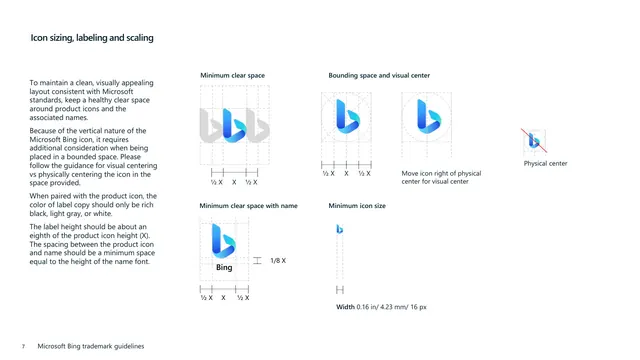
A detailed construction page for the Bing icon covering clear space, the difference between visual and physical centering, pairing the icon with its name, and the minimum icon size.
Visual description
White background with a bold "Icon sizing, labeling and scaling" heading top-left and a left column of body copy explaining the need for clear space, the icon's vertical nature requiring visual rather than physical centering, that paired label copy should be rich black, light gray, or white, and that label height should be about an eighth of the icon height. The right area is a multi-panel diagram grid. Top row: "Minimum clear space" (the gradient icon flanked by faded ghost icons with X and 1/2 X spacing brackets), "Bounding space and visual center" (the icon inside dashed bounding boxes with circular guides), and a small "Physical center" example struck through with a red diagonal line beside a note to move the icon right of physical center for visual center. Bottom row: "Minimum clear space with name" (icon above the word "Bing" with 1/8 X and 1/2 X callouts), and "Minimum icon size" (a tiny icon with a width callout of 0.16 in / 4.23 mm / 16 px). A footer with page number "7" sits bottom-left.
Key takeaway
The visual-versus-physical-centering demonstration, complete with a red struck-through "don't" example and an instruction to nudge the icon right, is a precise way to document an asymmetric mark. Tying label height to a fraction of the icon height (1/8 X) and using X-based brackets keeps every spacing rule proportional and unit-agnostic.
Reuse notes
An advanced reference for documenting an icon that is optically off-balance, where naive centering looks wrong. The combination of clear-space, bounding-box, centering, name-pairing, and minimum-size panels on one page is a thorough model for any product-icon construction sheet. The red strike-through convention reads instantly as a prohibition; reuse it for any "do not" in a guideline.
From this deck: Icon sizing, labeling and scaling
View deck


More like this








Keep what you find
A free account saves references to boards and can send you a weekly email of picks based on what you save.
To see every result, go Pro.