Preview image. Unlock full-res
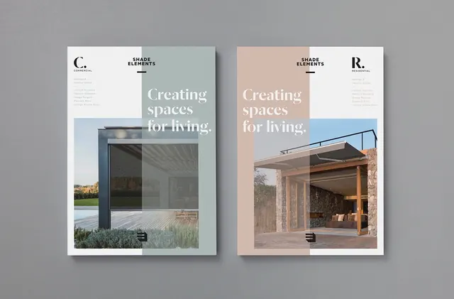
Design system identity mockup for Shade Elements showing two brand color palette variations with architectural photography and serif typography.
Summary
A brand system presentation showing Shade Elements identity across two color palette variations, each pairing muted earth tones with architectural product photography and refined serif headline typography.
Visual description
Two printed branding mockups displayed side by side on a gray background. Left card uses soft sage green and cream palette with black serif headline "Creating spaces for living." overlaid on architectural photograph of modern glass-fronted building. Right card uses warm peach and cream tones with similar serif treatment and photograph of warm-toned wooden structure. Both cards display monogram marks in corners (C. and R.). Minimalist layout with ample white space and justified typographic hierarchy.
Key takeaway
Cohesive brand systems leverage consistent typography and photography treatment across multiple color palettes. Muted, earthy tones with serif type convey premium, architectural positioning. The "Creating spaces for living" message unifies both variations despite different color choices.
Reuse notes
Ideal reference for design system identity work, particularly in architecture, interior design, or real estate branding. The color-palette approach shows how brands can expand across market segments while maintaining identity. Pairs well with professional photography and editorial layouts.
More like this



Keep what you find
A free account saves references to boards and can send you a weekly email of picks based on what you save.
To see every result, go Pro.