Preview image. Unlock full-res
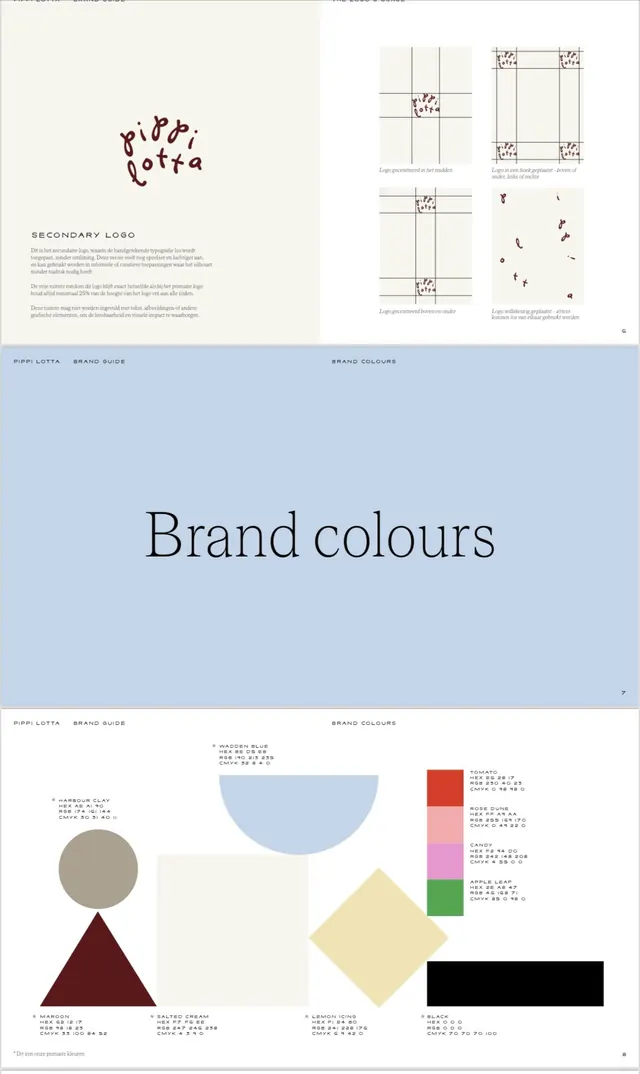
Brand-guide spreads for a hand-drawn logo identity, pairing a serif Brand Colours divider with a swatch page of named pastel colours and floating geometric shapes.
Summary
Three stacked brand-guidebook pages for the "Pippi Lotta" identity: a logo-usage page, a periwinkle "Brand colours" section divider set in a large serif, and a palette page that names each swatch in a tiny all-caps caption.
Visual description
The top page shows a scribbled maroon hand-drawn wordmark beside a "SECONDARY LOGO" heading and clearspace diagrams placing the mark centered, cornered, and scattered on faint grids. The middle page is a full periwinkle field with "Brand colours" centered in a black book-weight serif, a running header in caps, and a page number tucked in the corner. The bottom page floats flat geometric shapes (grey circle on a maroon triangle, periwinkle half-disc, cream square, yellow diamond, black bar) across off-white, while each primary colour is also stacked as labeled chips on the right with hex, RGB and CMYK values under names like Wadden Blue, Tomato and Apple Leaf.
Key takeaway
Naming every brand colour (Harbour Clay, Lemon Icing) so the palette reads as a vocabulary, not just hex codes. Using primitive geometric shapes as a neutral way to show colours interacting before any real application. The serif divider page that gives the deck a calm, editorial pause.
Reuse notes
A template for the colour section of a small-studio or lifestyle brand guide. The hand-drawn logo against the disciplined swatch grid is a good contrast pattern: playful mark, formal documentation. Pair with a type-specimen page set in the same caption style.
More like this


Keep what you find
A free account saves references to boards and can send you a weekly email of picks based on what you save.
To see every result, go Pro.