Preview image. Unlock full-res
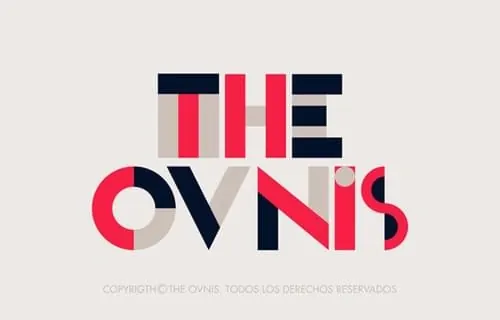
A cohesive brand identity system combining a geometric block composition mark with a split-color wordmark "THE OVNIS" using navy blue, bright red, and cream.
Summary
A complete brand identity system featuring a modular geometric mark composed of rectangular blocks and a coordinated wordmark where each letter is split between two contrasting colors.
Visual description
At the top, an abstract geometric mark made of rectangular blocks in navy blue, bright red, and cream arranged in a tight composition. Below, the wordmark "THE OVNIS" rendered in a bold geometric sans-serif where each letter is split vertically—portions filled with bright red, portions with navy blue, and some sections in cream. The split-color technique creates visual rhythm and ties the mark to the geometric blocks above. The cream background unifies both elements.
Key takeaway
Using modular geometric shapes and a consistent two-to-three color palette to create a cohesive identity system where the mark and wordmark share compositional logic. The split-color letter technique makes the typography as distinctive as the symbol.
Reuse notes
Excellent reference for building a modular identity system where a geometric mark can be used standalone while the wordmark carries the same design language through color blocking. The three-color palette (cream, navy, red) creates high contrast and vibrant energy. Best suited for brands seeking bold, modern, geometric expression.
More like this

Keep what you find
A free account saves references to boards and can send you a weekly email of picks based on what you save.
To see every result, go Pro.