Preview image. Unlock full-res
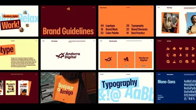
A multi-panel brand guidelines showcase pairing bold orange and burgundy blocks with geometric marks, type specimens, icon systems, and color palettes arranged in a modernist grid layout.
Summary
A multi-panel brand guidelines showcase pairing bold orange and burgundy blocks with geometric marks, type specimens, icon systems, and color palettes arranged in a modernist grid layout.
Visual description
Horizontal display of 8-10 distinct sections, each a brand system case study. Top-left shows "Brand Guidelines" in orange on dark red background. Adjacent panels feature a geometric mark (stylized bird or chevron in outline), bold sans-serif type specimens in white and orange, color palette swatches in burgundy and cream, an icon grid showing geometric symbols in a 3x3 arrangement, a full-color photograph of a hand holding an orange branded object, typographic specimen showing "Typography" header with blue letter forms, and numerals with modular construction lines. Overall: cream-colored background with sections separated by white borders. Orange (#FF7C33) dominates as the primary brand color, offset by deep burgundy (#510210) and navy blues, with black accent strokes defining geometric forms. The layout uses consistent margins and a visible modular grid system.
Key takeaway
The panel-based presentation format: six to ten discrete, fully self-contained case studies shown side-by-side on a neutral background lets viewers quickly understand the breadth of the identity system (mark, color, type, icons, applications, photography style). Color blocking with high contrast (orange against burgundy and cream) makes each section legible and vibrant without clutter. Showing the same system applied to different materials (printed object, digital text, icon sets) demonstrates versatility within a strict geometric language.
Reuse notes
Strong reference for designing brand guidelines presentations when you need to justify systematic thinking and show depth without overwhelming detail. The modular structure communicates that all elements derive from shared principles. Works especially well for creative agencies, design firms, and modern corporate identities that embrace geometric and sans-serif aesthetics. Pair this approach when you have multiple applications (signage, products, web, collateral) to show.
More like this








Keep what you find
A free account saves references to boards and can send you a weekly email of picks based on what you save.
To see every result, go Pro.