Preview image. Unlock full-res
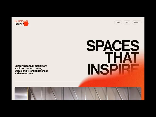
Design-studio landing page pairing a cream layout and small wordmark with an oversized black SPACES THAT INSPIRE headline whose right edge dissolves into a soft orange airbrushed gradient.
Summary
A studio homepage hero where a huge three-line black headline reading SPACES THAT INSPIRE sits on cream, with its right side fading into a soft orange airbrush glow that ties the type to the brand mark.
Visual description
Top-left holds a small stacked "Sundown Studio" wordmark with an orange dot punctuating it; a minimal Work / Studio / Contact nav sits top-right. A short left-aligned paragraph of body copy describes the studio. Dominating the right two-thirds is the oversized headline, set in a heavy condensed-ish sans, broken across three lines. The headline does not sit on flat cream: a diffuse orange-to-coral airbrushed gradient blooms from the lower right, so the last word partially dissolves into color. Below the fold a thin horizontal photographic strip (a corrugated or louvered metal surface) anchors the base. The orange dot in the logo and the orange bleed behind the type are the only chroma in an otherwise black-on-cream layout.
Key takeaway
Letting a soft airbrushed gradient bleed through and partially consume the oversized headline, so the type itself becomes the hero image. The single brand accent color (orange) appears twice, once as a tiny logo dot and once as the large atmospheric glow, linking small mark to big gesture.
Reuse notes
A strong template for a creative studio, architecture practice, or agency landing page that wants type-led impact without photography carrying the hero. Pairs well with a thin image strip at the fold to ground the airy upper half. Caveat: the dissolving last word trades a little legibility for atmosphere, so keep the headline short and recognizable.
More like this


Keep what you find
A free account saves references to boards and can send you a weekly email of picks based on what you save.
To see every result, go Pro.