Preview image. Unlock full-res
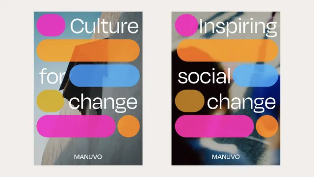
A two-poster campaign where stacked rounded capsule shapes in magenta, orange, and blue overlay duotone photos; white headlines nestle between the bars.
Summary
Two vertical campaign posters where fat rounded pill shapes in magenta, orange, and cornflower blue stack across a duotone background photo; white headline words nestle into the gaps between the bars.
Visual description
Two vertical posters side-by-side, mounted on a neutral off-white card. Each poster layers a darkened photographic background (landscape, water, or figure) behind rows of thick capsule shapes with fully rounded ends in magenta, orange, bright blue, and mustard yellow. The capsules, of varying lengths, stack in a rhythmic grid pattern. White sans-serif headlines sit between the bars: left poster reads Culture / for / change, right poster reads Inspiring / social / change. A small white MANUVO wordmark anchors the bottom center of each poster. The bar rhythm, placement, and type baseline are identical on both posters, signaling a repeatable system.
Key takeaway
Pill bars function as both decorative elements and content containers, so the same bar layout can wrap different photos and headlines without changing the grid structure. Letting headline words drop into the gaps between bars links typography and shape into a single reading rhythm, making the system feel integral rather than layered on top.
Reuse notes
A scalable poster kit for nonprofits, social-advocacy groups, or culture organizations that need branded variants quickly. The bright capsule palette carries enough color weight to pop over any photograph, freeing the background photo choice. Keep the bar grid and spacing locked across the series; vary only the photo and headline words to maintain family resemblance across many applications.