Preview image. Unlock full-res
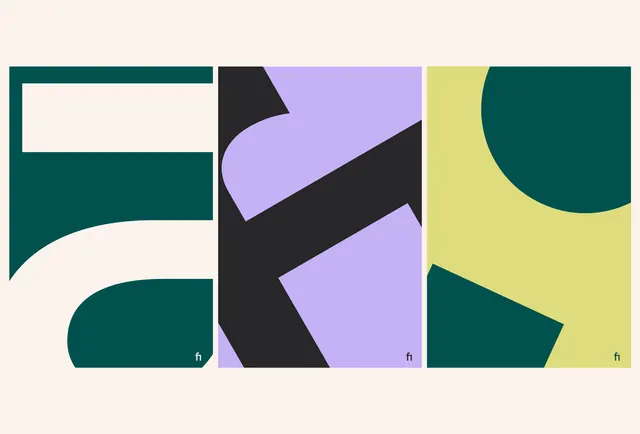
Three poster panels each crop a giant geometric letterform across overlapping color blocks of deep teal, lavender, black and chartreuse on a cream ground.
Summary
A three-panel series in which oversized geometric letterforms are cropped so tightly they read as abstract color blocks, in a palette of deep teal, lavender, black and chartreuse on cream.
Visual description
Three vertical panels sit on a warm cream ground with cream gutters between them. The left panel shows a deep teal letterform, possibly an F or E, its counters and a rounded bowl spilling off the edges. The center panel layers lavender, near-black and a curved stroke into an overlapping abstract that suggests a K. The right panel pairs chartreuse with a teal circle and angled wedge. Each letterform is enlarged far past its frame so only fragments are visible, turning type into flat color shapes. A small lowercase "fi" ligature mark sits in the bottom-right corner of every panel as a consistent signature.
Key takeaway
Cropping letterforms hard enough that they stop reading as letters and become pure composition, while a repeated corner monogram ties the set together. The restrained but unexpected palette, deep teal plus soft lavender and acid chartreuse, shows how three odd hues can stay sophisticated when balanced on a neutral cream.
Reuse notes
A reference for a brand system that wants a flexible, generative visual language: crop the wordmark or initial differently per panel for a series of covers, social tiles, or section dividers. Keep one constant, the corner mark and the cream ground, so the varied crops still read as one family.
More like this
Keep what you find
A free account saves references to boards and can send you a weekly email of picks based on what you save.
To see every result, go Pro.