Preview image. Unlock full-res
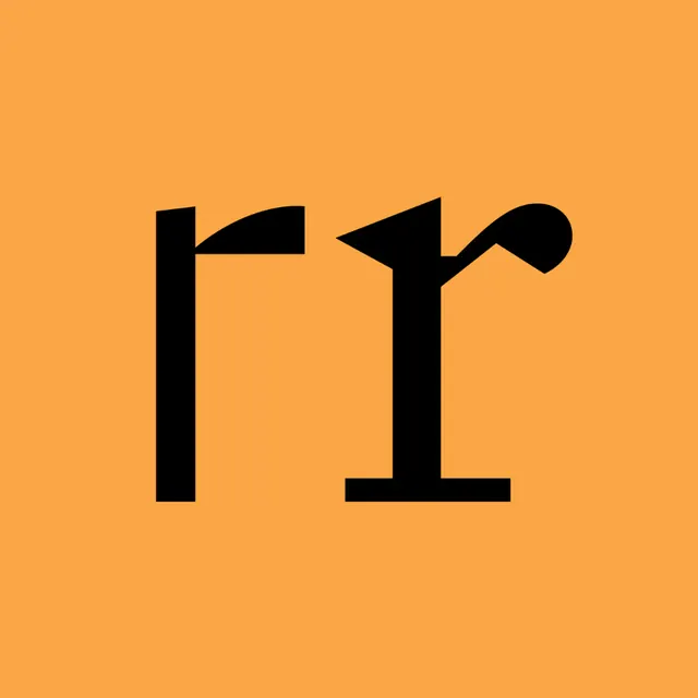
A bold black lowercase double-r set as custom display lettering on a full-bleed orange field, the two r's drawn with mismatched, experimental terminals.
Summary
A single square tile filled edge-to-edge with warm orange, holding two oversized black lowercase r glyphs whose terminals are drawn differently, making the piece read as a type-design experiment or a custom monogram.
Visual description
The full-bleed orange (amber) background carries no other elements, throwing all attention onto two heavy black letterforms placed side by side in the optical center. Both are lowercase r's but cut from the same stem-and-arm logic with deliberately varied details: the left r has an angular, slab-flat arm; the right r adds a teardrop ball terminal at the arm and a small foot serif at the base, so the pair looks like a before/after or two weights of the same designed glyph. The strokes are thick and confident with crisp geometric cuts. The square format and centered placement give it a tile or app-icon feel.
Key takeaway
Showing two variants of one letter side by side as the entire composition: it turns a type study into a finished graphic and communicates "designed typeface" at a glance. The single warm field plus pure black glyphs is a cheap, high-impact contrast formula.
Reuse notes
Use for a typefoundry promo, a lettering portfolio tile, or a monogram-driven brand where the letterform itself is the hero. Square crop makes it drop-in ready for avatars and app icons. Caveat: it is a specimen, not a wordmark, so it carries no name and needs supporting type to function as real branding.
More like this

Keep what you find
A free account saves references to boards and can send you a weekly email of picks based on what you save.
To see every result, go Pro.