Preview image. Unlock full-res
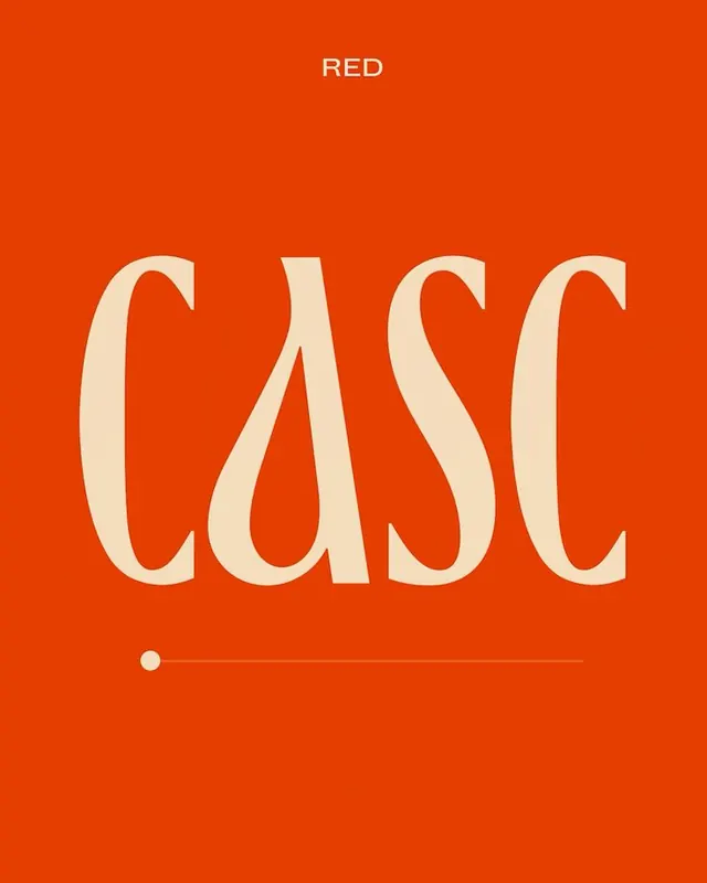
A cream high-contrast display wordmark reading CASC set huge on a saturated burnt-orange field, with a small RED label and a slider element beneath.
Summary
A two-color type study: the word CASC set oversized in a cream high-contrast display face, dominating a saturated burnt-orange canvas.
Visual description
The letters CASC fill most of the frame in a warm cream tone against a flat burnt-orange ground. The face is a high-contrast display with sharp flared terminals and a teardrop spur on the lowercase a, mixing tall caps with a single lowercase a for an irregular rhythm. A small all-caps label "RED" sits centered at the top. Below the wordmark a thin horizontal rule runs across with a filled circular handle near its left end, reading as a slider or progress track. The whole composition is centered and uses only two colors, letting the letterforms carry the weight.
Key takeaway
The mixed-case trick: dropping one lowercase letter into an otherwise all-caps display lockup to break the rhythm and add character. Pairing a single tiny label and a slider line as the only secondary elements keeps a one-word layout from feeling empty without diluting the type.
Reuse notes
A strong reference for a single-word brand or section title where the typeface itself is the hero. The two-color, high-saturation pairing reads well as a poster, cover, or hero. Swap the orange for any bold flat hue; the move depends on the high-contrast face and the lone lowercase letter, not the color.
More like this


Keep what you find
A free account saves references to boards and can send you a weekly email of picks based on what you save.
To see every result, go Pro.