Preview image. Unlock full-res
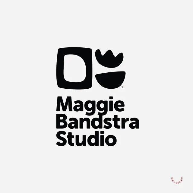
A black logo for Maggie Bandstra Studio pairs three chunky hand-drawn shapes, a soft square, a crown, and a half-bowl, above a bold lowercase wordmark on light grey.
Summary
A black-on-grey identity for Maggie Bandstra Studio that stacks a cluster of three chunky hand-drawn marks, a rounded square, a crown or tulip, and a half-bowl, over the studio name set in a heavy rounded lowercase sans.
Visual description
Centered on a flat light-grey field, the symbol sits up top: a soft-cornered square outline (an organic "D" or window) on the left, and to its right a small crown or tulip shape above a filled half-circle bowl, with a tiny copyright mark tucked at the cluster's edge. Below, the name reads "Maggie / Bandstra / Studio" on three left-aligned lines in a bold, rounded lowercase sans with generous weight and friendly terminals. Everything is solid black, the only other color being the subtle grey ground and a small red circular foundry stamp lower-right.
Key takeaway
The mark gets its character from imperfect, hand-drawn shapes rather than ruler-perfect geometry, which makes a monochrome studio logo feel warm and crafted instead of corporate. Pairing those loose marks with a heavy, very round wordmark keeps the whole thing cohesive: both halves share the same soft, slightly wobbly personality.
Reuse notes
A good template for a small creative studio, ceramicist, florist, or maker brand that wants approachable rather than slick. Works in pure black so it survives single-color print, stamps, and embroidery. Reach for the hand-drawn-symbol-over-rounded-wordmark formula when warmth and craft matter more than precision.
More like this







Keep what you find
A free account saves references to boards and can send you a weekly email of picks based on what you save.
To see every result, go Pro.