Preview image. Unlock full-res
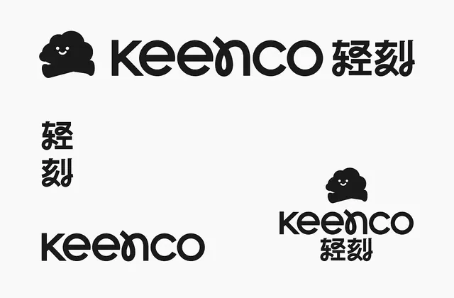
A minimal bilingual logotype combining a cheerful smiling cloud mascot with geometric sans-serif wordmark and Japanese kana in a monochrome system.
Summary
A minimal bilingual logotype combining a cheerful smiling cloud mascot with geometric sans-serif wordmark and Japanese kana in a monochrome system.
Visual description
Monochrome branding system shown across four compositional variations, all solid black on off-white background. Primary mark is a rounded, smiling cloud character (simple smile and dot eyes). Logotype pairs the cloud with a modern, wide geometric sans-serif wordmark "keenco" followed by Japanese kana characters. Supporting specimens show the mark scaled in different sizes, the name repeated with kana stacked vertically (left variation), and pairing of cloud mascot with horizontal lockups. All type is uniform sans-serif, clean and contemporary.
Key takeaway
The pairing of a simple geometric mascot character with a straightforward sans-serif name, creating accessibility and approachability without decoration. The use of Japanese characters not as texture or secondary element but as equal typographic mass, reflecting true bilingual identity. The repetition of the cloud mark at different scales and contexts demonstrating modular flexibility. The stark monochrome execution proving the mark works across all contexts.
Reuse notes
Works well for consumer apps, education products, or services targeting Asian markets (English + Japanese). The friendly mascot tempers the stark monochrome aesthetic; the mark is legible and memorable at small sizes. The bilingual layout strategy is useful for dual-language brands. Less suitable for luxury or premium positioning where minimalism might read as empty rather than intentional.
More like this





Keep what you find
A free account saves references to boards and can send you a weekly email of picks based on what you save.
To see every result, go Pro.