Preview image. Unlock full-res
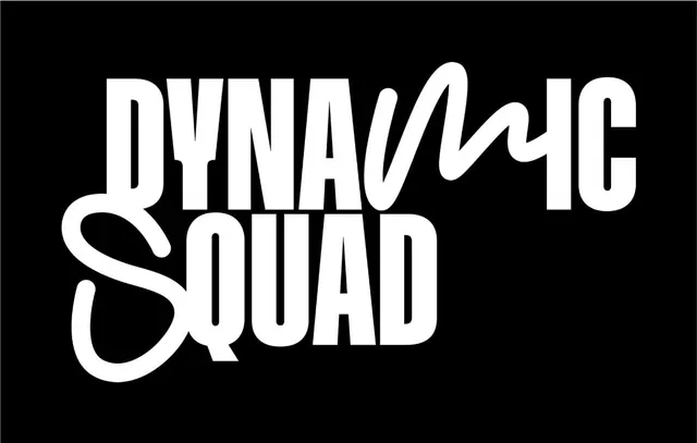
Playful black-on-white wordmark with a hand-drawn wave underline, using stacked bold sans-serif letters for an esports or creative team identity.
Summary
Two-word stacked wordmark "Dynamic Squad" in bold display sans-serif with a flowing hand-drawn wave accent cutting through the letters, creating a confident yet approachable brand mark.
Visual description
Full-frame black background with white centered text. "Dynamic" appears first in all capitals, followed below by "Squad" in matching bold sans-serif weight and proportions. A smooth, organic curved line flows through both lines of text, crossing from upper-left through the middle and exiting lower-right, adding a single hand-drawn accent element to otherwise rigid geometric letterforms. The wave has slightly rounded endpoints, creating a signature flourish that humanizes the otherwise corporate-clean type. All letters maintain uniform stroke weight and geometric form. No additional ornamentation.
Key takeaway
The minimal use of a single hand-drawn element (the wave line) to add personality and movement to a geometric sans-serif wordmark. This technique avoids over-design while maintaining brand distinctiveness. Stacking the wordmark creates vertical strength, especially for social media profiles or team emblems.
Reuse notes
Ideal for esports teams, creative agencies, or any group-oriented brand aiming for both professionalism and energy. The high contrast (black/white) works for printing, dark-mode UIs, and embroidery. The accent line should be repositioned proportionally if scaling; test at small sizes (favicon, app icon) as the wave may become hard to discern. Works best as a primary mark for square canvas (avatar, badge, emblem).
More like this






Keep what you find
A free account saves references to boards and can send you a weekly email of picks based on what you save.
To see every result, go Pro.