Preview image. Unlock full-res
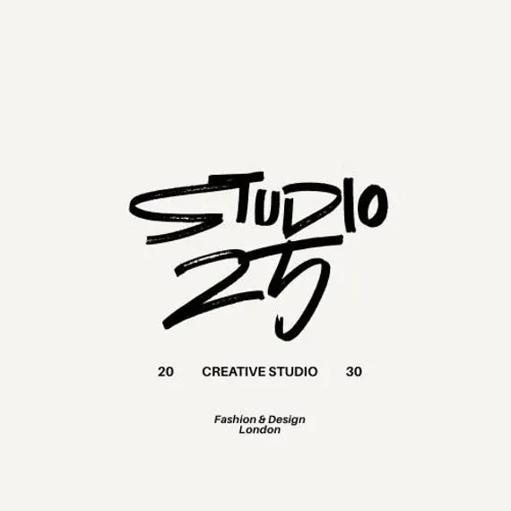
Creative studio identity using a hand-drawn brush logotype with year accent and London location text, centered on light ground.
Summary
A creative studio identity built entirely from hand-drawn brush letterforms spelling "STUDIO 25," anchored with founding year notation and London location.
Visual description
A light gray ground centers a hand-drawn logotype where uppercase letterforms appear struck with a thick brush, creating an intentionally crude, gestural energy. The word "STUDIO" sits above the number "25," both rendered in expressive black strokes with visible pressure variation and slight roughness. Below the mark sit three elements in small modern sans-serif type: the numbers "20" and "30" flanking the words "CREATIVE STUDIO," followed on the next line by "Fashion & Design" and "London" in italic. The composition is vertically centered and symmetrical, relying entirely on the contrast between the raw, energetic letterforms and the minimal supporting text.
Key takeaway
The hand-drawn logotype as a statement of creative authenticity and personality. The contrast between the distressed, organic brush letterforms and clean, precise supporting type creates visual tension that communicates both established craft and contemporary edge. The year notation (25, likely a founding year) adds authority and longevity perception. The centered, stacked arrangement makes the mark work at any scale.
Reuse notes
Ideal for design studios, creative agencies, or independent makers seeking to project confidence and artistic credibility. Works particularly well for design, fashion, or bespoke service brands. The hand-drawn quality pairs well with clean sans-serif supporting typography and simple, minimal color palettes. Can be adapted by changing the text while maintaining the brush-drawn structural approach.
More like this



Keep what you find
A free account saves references to boards and can send you a weekly email of picks based on what you save.
To see every result, go Pro.