Preview image. Unlock full-res
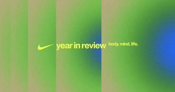
A wide year-in-review banner pairing a logo swoosh with white lowercase type and a dotted tagline over a striped green-to-blue gradient field.
Summary
A horizontal year-in-review banner that runs a brand swoosh straight into white lowercase headline type, set over a soft gradient that drifts from olive and lime green into teal and blue.
Visual description
The frame is a wide letterbox banner filled with a gradient organized as soft vertical bands: warm olive and lime greens on the left give way to teal and a deeper blue glow on the right, the bands blurred so they read as light rather than hard stripes. Centered on the left-middle, a white swoosh mark butts directly against "year in review" in white lowercase sans, with the mark acting like a leading word in the phrase. A smaller dotted tagline, "body. mind. life.", trails to the right on the same baseline. There is no other copy, and the gradient carries most of the visual interest.
Key takeaway
Letting the logo mark sit on the headline baseline as if it were the first word, so brand and message read as one phrase. The vertical-band gradient gives a flat banner depth and a calm-to-energetic color shift without any imagery.
Reuse notes
A clean format for recap, year-in-review, or wrapped-style summaries from fitness, wellness, or consumer apps. The lockup scales to email headers and social cards. The green-to-blue gradient signals health and renewal; swap the hue range to re-theme while keeping the white-type-on-gradient structure. Keep headline type white for contrast against the brighter green zone.
More like this


Keep what you find
A free account saves references to boards and can send you a weekly email of picks based on what you save.
To see every result, go Pro.