Preview image. Unlock full-res
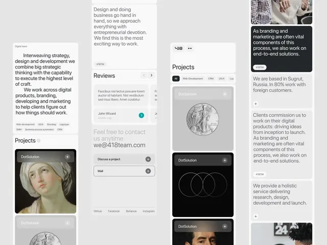
A multi-column studio website UI built from soft rounded cards, mixing about copy, project thumbnails, a reviews carousel, and a contact block.
Summary
A web UI for a digital studio (418team), assembled from many soft, rounded white and black cards across several columns, with project thumbnails, a reviews carousel, capability tag chips, and a contact card.
Visual description
The screen is a near-grayscale interface on a light gray ground. Content is broken into rounded-corner cards of varied heights, some white, some charcoal-to-black, each carrying a small plus button in the top-right corner. The left column leads with an indented About paragraph and a row of pill tag chips (Web-development, UIUX, Branding, Logotype, SMM, CRM). A central column holds a logo lockup, a filter bar (All, Web-Development, CRM, UIUX), and Projects cards including a classical portrait painting and a black card with two overlapping circle outlines. A Reviews card has left/right carousel arrows; a contact card invites email to we@418team.com. Type is a single clean sans in dark gray on light and white on dark.
Key takeaway
The repeated rounded card with a corner plus button gives a heterogeneous page one consistent unit and a clear affordance to expand each item. Mixing a classical painting thumbnail into an otherwise austere grayscale system adds a single warm, human focal point.
Reuse notes
A strong pattern for a creative studio or portfolio homepage that needs to show services, work, and social proof in one scroll. The card-and-plus system scales to a CMS; pair it with one unexpected image to break the neutrality.
More like this


Keep what you find
A free account saves references to boards and can send you a weekly email of picks based on what you save.
To see every result, go Pro.