Preview image. Unlock full-res
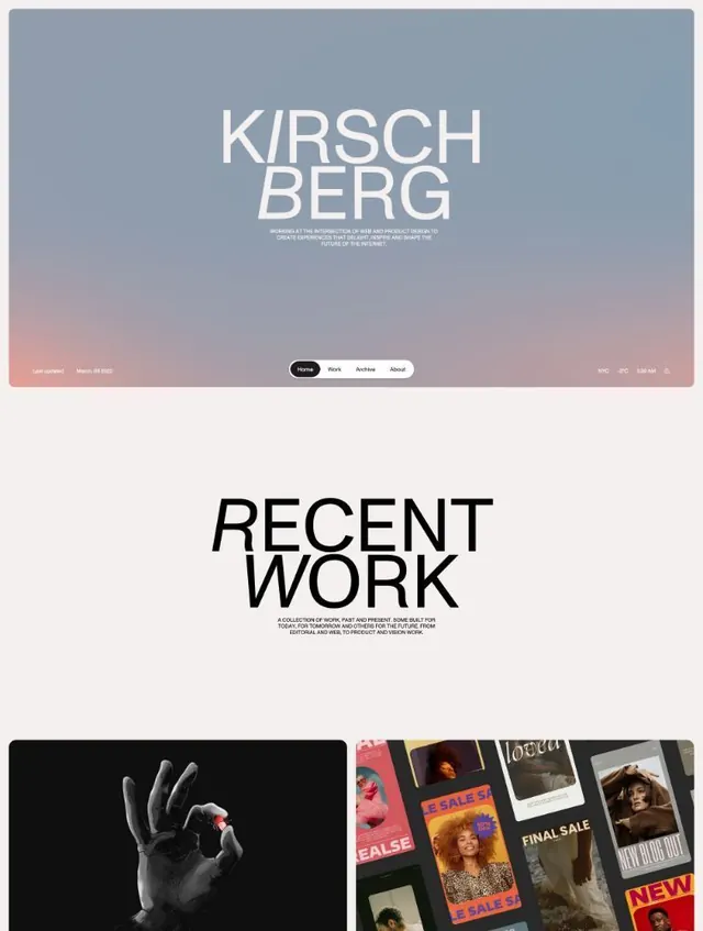
Designer portfolio homepage stacking a 'KIRSCHBERG' wordmark over a dusk gradient with a pill nav, then a giant black 'RECENT WORK' header above a project grid.
Summary
A web/product designer's portfolio homepage that leads with a centered "KIRSCHBERG" wordmark over a soft blue-to-peach dusk gradient, then drops into an oversized black "RECENT WORK" section header above the first project thumbnails.
Visual description
The hero fills the top viewport with a smooth gradient running from cool steel-blue at the top to warm peach-pink at the bottom. Centered over it, "KIRSCHBERG" is set in a thin, tall display sans split across two lines, with the "I" letters cut to an italic/oblique slash so the otherwise upright type gets a single dynamic accent. A short three-line italic mission statement sits under it. A black rounded pill navigation (Home, Work, Archive, About) floats at the bottom center, flanked by tiny utility readouts (a "Last updated" date left; a city, temperature, and live clock right). Below the fold, on a near-white off-white ground, a huge black "RECENT WORK" header uses the same oblique-I trick at display scale, with small justified intro copy beneath, then a two-up grid begins: a moody black-and-white hand holding a red object, beside a colorful collage of fashion sale graphics.
Key takeaway
The single typographic signature: keep a tall thin display face fully upright except for the "I", which is sliced to an oblique, so the whole identity gets one memorable kinetic detail with near-zero clutter. Also the floating pill nav paired with live utility micro-data (clock, temperature, last-updated) that makes a static portfolio feel like a living product.
Reuse notes
A strong template for individual designer, developer, or studio portfolios that want premium restraint up top and a confident editorial handoff into work. The dusk-gradient hero leans calm and personal; swap it for a flat color if the brand needs to read more corporate. The oversized headers demand generous whitespace, so they suit roomy desktop layouts more than dense ones.
More like this


Keep what you find
A free account saves references to boards and can send you a weekly email of picks based on what you save.
To see every result, go Pro.