Preview image. Unlock full-res
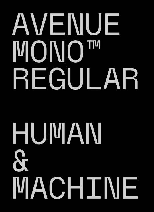
A black poster setting a light-gray monospaced typeface in stacked all-caps, naming the family and a HUMAN & MACHINE tagline to show its width and rhythm.
Summary
A portrait type specimen on solid black: a monospaced typeface labeled "AVENUE MONO REGULAR" set in light-gray all-caps and stacked, followed by the phrase "HUMAN & MACHINE" to demonstrate its even spacing and angled-leg letterforms.
Visual description
Two left-aligned text blocks sit on a pure-black field with generous margins. The top block reads "AVENUE / MONO TM / REGULAR" across three lines; the lower block reads "HUMAN / & / MACHINE". Type is a fixed-width monospace in medium gray, all uppercase, with distinctive angled apexes on the A and M and a tall trademark mark. The monospace metrics make every line start cleanly and give the stack a tabular, engineered rhythm. No imagery, color, or decoration: the contrast of light gray on black and the negative space carry the whole composition.
Key takeaway
Using a monospace at display size lets you stack words into a tidy left-aligned column where the fixed character width does the alignment for you. Gray-on-black instead of pure white softens the glare and reads more premium and technical than stark white text.
Reuse notes
A clean template for a typeface release card, a developer-tool or studio identity, or any "human and machine" tech positioning. Monospace at this scale exposes every glyph quirk, so it suits brands that want to look precise and engineered. Keep it to one or two short stacked phrases; long body copy in this style gets tiring to read.
More like this



Keep what you find
A free account saves references to boards and can send you a weekly email of picks based on what you save.
To see every result, go Pro.