Preview image. Unlock full-res
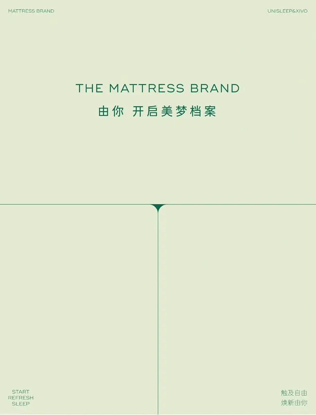
A poster for a mattress brand setting letterspaced green caps and Chinese copy on a pale sage field, organized by a thin cross-hair grid with corner labels.
Summary
A near-monochrome sage poster that anchors a centered, widely letterspaced headline over a thin structural grid, with small corner-set labels framing the composition.
Visual description
The whole sheet is a soft pale-green wash, with all type in a slightly deeper green for a tonal, low-contrast read. "THE MATTRESS BRAND" runs across the upper third in letterspaced sans caps, with a line of Chinese copy directly beneath it. Below, a thin horizontal rule crosses the full width and a thin vertical rule drops from a small downward-pointing triangle at their intersection, splitting the lower half into two columns of open space. Tiny labels sit in all four corners: brand tags top-left and top-right, a three-line stacked "START / REFRESH / SLEEP" bottom-left, and Chinese sub-copy bottom-right. The lower two-thirds are intentionally empty.
Key takeaway
The cross-hair grid, one full-width rule plus a dropped vertical marked by a small triangle, that organizes a mostly empty page and makes the emptiness feel composed rather than unfinished. Tonal type, deep green on pale green, reads as quietly premium without any hard contrast.
Reuse notes
Good template for calm, high-end retail or wellness brands, and for bilingual layouts where English and CJK copy need to coexist. The corner-label system scales to product specs, locations, or section names. Keep contrast low to hold the serene mood, but verify the type still clears accessibility minimums for any essential copy.
More like this



Keep what you find
A free account saves references to boards and can send you a weekly email of picks based on what you save.
To see every result, go Pro.