Preview image. Unlock full-res
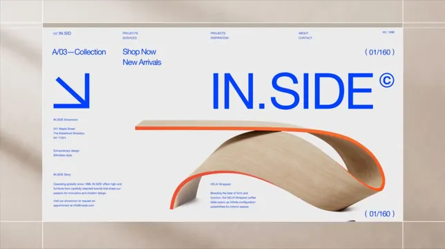
High-end furniture brand website using electric-blue Helvetica and a Swiss grid layout, with a single sculptural bent-plywood table outlined in orange as the hero object.
Summary
A gallery-like furniture e-commerce hero for IN.SIDE that uses electric-blue Helvetica type, Swiss-grid structure, and a single sculptural plywood table rendered with an orange outline.
Visual description
A near-white background is overlaid with thin guide lines forming a Swiss grid. The entire composition uses only one color for all interface elements: saturated cobalt blue. Top left sits a reversed-wave logo mark; above the fold runs a lean four-column navigation (Projects/Services, Projects/Inspiration, About/Contact, NY 1998). Pagination markers read 01/160 in the top-right and bottom-right corners, suggesting a catalog-like slideshow. The oversized IN.SIDE wordmark breaks across the right side, with a circled copyright symbol as a small editorial signature. A chunky downward-right arrow in blue anchors the left column above the showroom address (241 Maple Street, Brooklyn) and a brief story block describing the brand philosophy. The right half showcases a sculptural bent-plywood table with its top surface and inner curve traced in bright burnt orange, casting a subtle shadow on the ground. The form reads as both functional and artistic.
Key takeaway
Locking the entire interface to a single accent color (blue) makes the one competing color (orange outline on the product) the focal point without competing elements. The 01/160 counter top and bottom transforms a static page into a catalog-slide experience, encouraging browsing. Oversized wordmark bleeding off-right with a tiny circled-C creates an editorial, curated feel over a product-gallery grid.
Reuse notes
Strong template for high-end furniture, design, or gallery brands that want editorial presence over commercial product lists. Requires a genuinely sculptural product render to carry the right half. The monochrome-blue treatment is fragile: it works here because the ground is near-white, but it collapses if placed over a busy photograph. Best for featuring one hero piece per page rather than multiple products.
More like this




Keep what you find
A free account saves references to boards and can send you a weekly email of picks based on what you save.
To see every result, go Pro.