Preview image. Unlock full-res
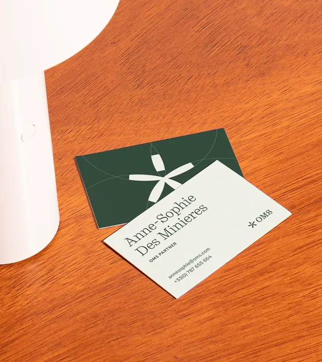
A stationery mockup showing two business cards angled on honey-toned wood: a cream front with minimal serif typography and a small star mark, a forest-green reverse, with soft-white tabletop styling.
Summary
A styled stationery shot: two business cards resting at an angle on a warm honey-toned wood surface, showing both the cream-and-serif front and the solid forest-green back as a cohesive identity system.
Visual description
Two rectangular business cards lie diagonally across the lower two-thirds of a smooth honey-brown wooden table surface. The front card is off-white or cream, carrying the owner's name in small serif type positioned at the left edge and a tiny star or asterisk glyph at the right, with faint secondary sans-serif details below. Tucked behind and slightly above the front card, the back side of a second card shows only its deep forest-green face with a single small centered mark or insignia. Framing the upper-left edge of the composition is the soft curve of a pale-white tabletop object (lamp base or device), providing tonal contrast against the warm wood. Lighting is bright and even, typical of a product or editorial flat-lay. The image is low-resolution, so fine typography details are not fully crisp.
Key takeaway
A two-color card system where one side is nearly blank (or minimal) and the reverse is solid creates elegant simplicity; the front focuses on name and mark, the back on color and material. Photographing the cards stacked at an angle on raw wood surface shows the depth of the materials and both sides of the identity in a single honest frame. The muted forest green against warm wood tones feels earthy and grounded rather than corporate.
Reuse notes
Strong template for consulting, creative studio, or professional-services brands seeking warmth over sterile corporate polish. The color palette (forest green + cream + warm wood) works for any practice that values craft and sustainability positioning. To use as a real specimen, re-shoot at higher resolution to capture the typography clearly. The diagonal angle and natural wood surface add authenticity; avoid overly stylized props.
More like this


Keep what you find
A free account saves references to boards and can send you a weekly email of picks based on what you save.
To see every result, go Pro.