Preview image. Unlock full-res
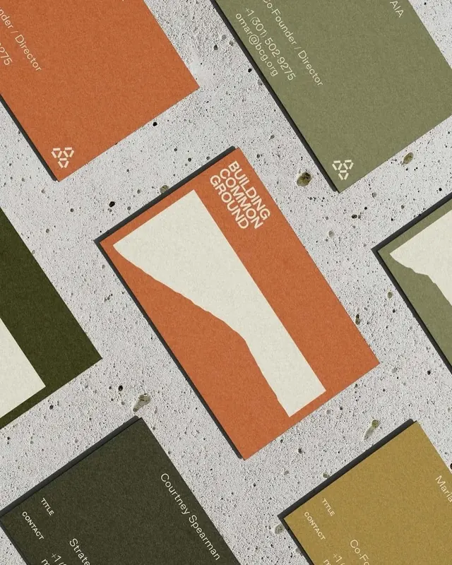
A collection of angled business cards or print collateral in warm earthy tones (terracotta, olive, cream) with minimal branding marks, displayed in a dynamic scattered composition on a speckled concrete background.
Summary
A collection of minimal business cards or branded collateral arranged at angles on a speckled concrete background, featuring a warm earthy color palette of terracotta, olive, and cream with small symbol marks.
Visual description
Six printed cards or panels positioned at overlapping diagonal angles across a light concrete or terrazzo surface. The cards employ a restricted palette of warm, muted tones: terracotta orange, olive green, cream, and greyish taupe. Each card displays minimal typography (white text on colored grounds) and a small triangular symbol or logo mark in the corner. One prominent card features a two-color split (cream and terracotta) with white type treatment. The texture of the background and the shadows cast by the overlapping cards add depth and tactile quality. The color harmony is analogous and warm.
Key takeaway
The earthy, muted color palette feels sophisticated and timeless without relying on bright accent colors. The angled arrangement in the mockup makes the static system feel dynamic and engaging. The minimal type and symbolic marks maintain restraint while creating visual interest. The concrete background choice emphasizes the organic, natural character of the palette.
Reuse notes
Ideal for brands wanting a warm, approachable, yet professional identity (creative agencies, wellness, artisanal products, heritage brands). The palette translates well to digital interfaces as accent colors. Analogous warm-tone systems feel cohesive and are less fatiguing than high-contrast schemes. Works especially well for print-first or craft-focused organizations.
More like this




Keep what you find
A free account saves references to boards and can send you a weekly email of picks based on what you save.
To see every result, go Pro.