Preview image. Unlock full-res
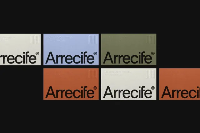
Arrecife identity shown as business cards in five muted colorways, each pairing a bold lowercase wordmark with a small ribbed audio-bar emblem and a Spanish tagline.
Summary
A business-card identity for "Arrecife" laid out as a two-row grid of cards on a black backdrop, each card a different muted colorway carrying the same lowercase wordmark, trademark symbol, and ribbed corner emblem.
Visual description
Six landscape cards float on near-black, arranged in a loose two-row grid that runs off the right edge. Colorways cycle through bone white, periwinkle blue, olive green, and terracotta rust. Each card carries the wordmark "Arrecife" in a large lowercase grotesque sans with a small superscript registered-trademark mark, set near the lower edge in black. Top left holds a two-line italic Spanish tagline, "Escucha cada sonido, vive cada matiz." Top right of every card sits a small emblem of varied-height vertical bars suggesting an equalizer or sound waveform, rendered as a tonal emboss that nearly matches each card color. The repeated layout across changing grounds reads as a deliberate colorway sheet rather than separate designs.
Key takeaway
The fixed-layout, swappable-ground approach: identical type and emblem placement across multiple muted colorways proves the system flexes without losing identity. The tone-on-tone embossed emblem adds tactile interest while staying quiet enough not to fight the wordmark.
Reuse notes
A strong template for audio, music, or media brands needing a stationery system that scales to many color variants. The equalizer emblem ties the abstract mark to the product category. Present colorways as a grid like this in pitch decks to sell range at a glance; just keep the wordmark placement locked so the set reads as one family.
More like this




Keep what you find
A free account saves references to boards and can send you a weekly email of picks based on what you save.
To see every result, go Pro.