Preview image. Unlock full-res
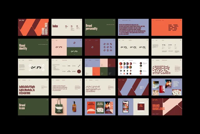
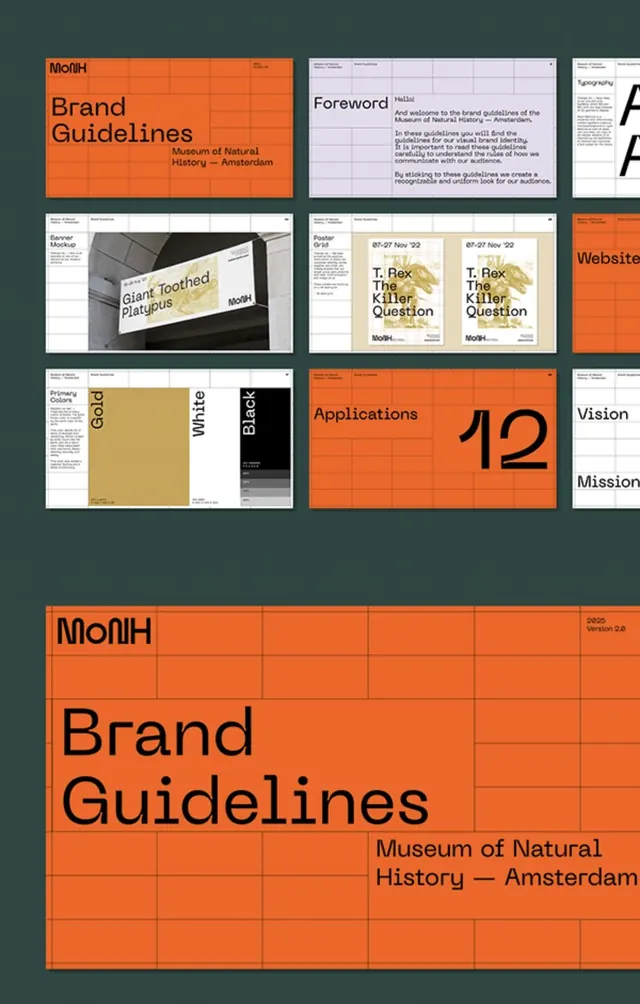
Comprehensive brand identity system displayed as a 5x4 grid of thumbnail cards, each showcasing a distinct brand element: logos, color palettes, icons, typography, packaging, photography, and layout patterns.
Summary
A grid-based brand-system overview compressing logos, color palettes, icons, typography, product mockups, photography directions, and pattern variations into a uniformly sized card layout.
Visual description
Twenty rectangular cards arranged in a precise 5-column by 4-row grid on a dark charcoal background. Top row: orange and burgundy striped logo card, cream color-palette card, forest-green brand-identity specimen, lavender and burgundy split composition, coral/orange solid block. Second row: olive-green "Visual Identity" card with abstract line-icon system, soft pink minimal card with small curved icon, pale tan textured background, deep burgundy-maroon with small purple geometric marks, white card with symbol grid. Third row: cream background with small bold symbols, blue-to-lavender split with orange and terra-cotta blocks and icon variations, light field with color-palette swatches (burgundy, navy, cream), final row features text-heavy specimen cards, product packaging mockups (bottles, boxes in warm tones), a mobile app template, and a final coral card with geometric diagonal stripe. Throughout, warm earth tones (terracotta, olive, cream, burgundy) and cool accents (lavender, navy) show restraint; typography is sans-serif and small-scale.
Key takeaway
The card-based grid format for communicating systems: it allows each element to breathe while showing scope and coherence at a glance. The warm-earth-plus-cool-accent color split maintains visual richness without chaos. The use of uniform card sizes and a dark background gallery frame creates a "identity library" feel that documents and celebrates a system's breadth. Effective for brand guidelines PDFs, investor decks, or internal team handbooks.
Reuse notes
Ideal for presenting comprehensive brand systems to stakeholders, internal teams, or in a printed brand guideline. The warm palette suggests luxury or lifestyle sectors (food, fashion, hospitality); adapt colors to reflect the target vertical. Best when each card is a real artifact (specimen page, icon set, color swatch, or photo) rather than mockup-upon-mockup. Works as a table of contents, overview page, or summary poster for larger brand documentation. May feel overwhelming if applied to simpler (2-3 element) brands; scale the grid density to match complexity.
More like this



Keep what you find
A free account saves references to boards and can send you a weekly email of picks based on what you save.
To see every result, go Pro.