Preview image. Unlock full-res
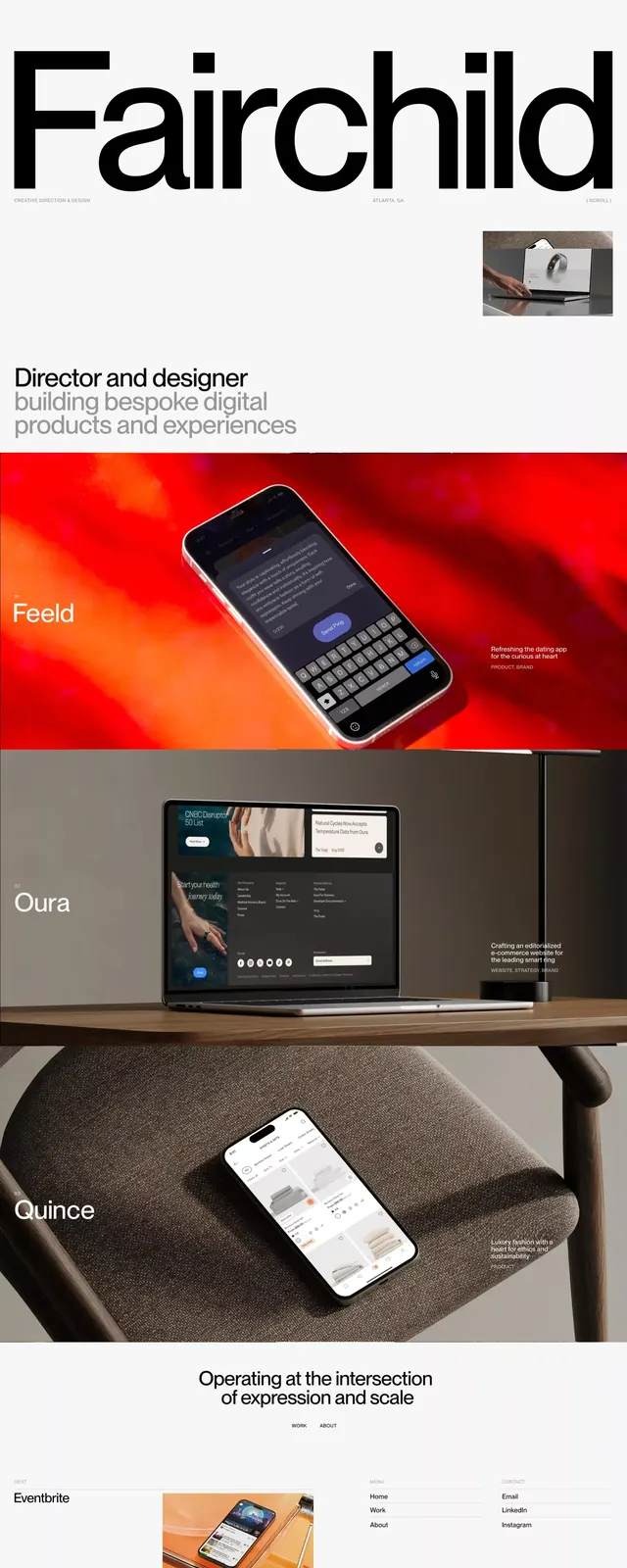
Designer-portfolio landing page led by an oversized 'Fairchild' wordmark above a stack of labeled project rows, each pairing a device mockup with a colored backdrop.
Summary
A single-scroll designer portfolio that opens with a huge "Fairchild" wordmark and a one-line role statement, then runs a vertical stack of project bands, each labeled in the left margin and filled with a device mockup over a distinct color.
Visual description
The top of the page is near-white with a small top nav, then a very large black "Fairchild" wordmark spanning the full width, with a short "Director and designer building bespoke digital products and experiences" line below in small dark sans-serif. Beneath the masthead, full-width horizontal bands present projects in sequence: a red band labeled "Feeld" holding an angled phone mockup, a darker band labeled "Oura" with a laptop showing a site, and a textured grey band labeled "Quince" with a phone on a chair. Each project name is set small in the lower-left of its band. A centered line, "Operating at the intersection of expression and scale," divides the projects from a final lighter "Eventbrite" row. The system stays monochrome except for the per-project background colors, with consistent left-aligned labels throughout.
Key takeaway
The labeled full-bleed project band: one project per horizontal strip, name pinned to a fixed corner, a single device mockup floated over a color or texture chosen per project. It turns a portfolio into a rhythmic scroll where color does the wayfinding while type and layout stay uniform.
Reuse notes
Ideal for a freelance designer, art director, or small studio site with a handful of strong case studies. Each band needs one genuinely good mockup to carry it, so it favors quality over quantity. The oversized name masthead sets an editorial tone; pair it with restrained nav and a single centered statement to break the rhythm midway.
More like this



Keep what you find
A free account saves references to boards and can send you a weekly email of picks based on what you save.
To see every result, go Pro.