Preview image. Unlock full-res
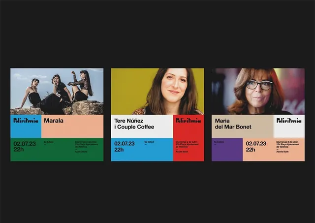
Three Poliritmia concert posters built on one modular color-block grid, each pairing a performer portrait with a distinct palette and a custom stencil-cut logotype.
Summary
A three-up concert poster series for Poliritmia, each landscape card running the same color-block grid (portrait, performer name, date, venue) but reshuffled into a different layout and palette so the set reads as a family.
Visual description
Three horizontal posters sit side by side on a near-black background. Each splits into a photo band over a band of solid color blocks. The portraits vary: a seated trio outdoors, a smiling woman on chartreuse, a woman in glasses against a red interior. Below, the grid carries the performer name in heavy black sans-serif, the "Poliritmia" wordmark in a custom stencil-cut display face, and a date/time block ("02.07.23 / 22h") beside small Catalan venue copy. The blocks rotate position card to card, blue and green here, blue and red there, lilac and peach in the third, so a single template generates visibly different posters.
Key takeaway
A modular block grid where the photo, name, logo, and date each own a rectangle, and the variation comes purely from swapping which color fills which block. The stencil-cut wordmark stays fixed across all three, giving series cohesion while everything around it changes.
Reuse notes
Ideal for festival, concert, or lecture-series identities that need many posters fast from one system. Swap portrait and palette per act, lock the grid and the logotype. Works best printed large or as a social carousel; the dense corner copy needs a real type hierarchy to stay readable.
More like this



Keep what you find
A free account saves references to boards and can send you a weekly email of picks based on what you save.
To see every result, go Pro.