Preview image. Unlock full-res
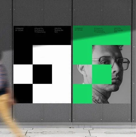
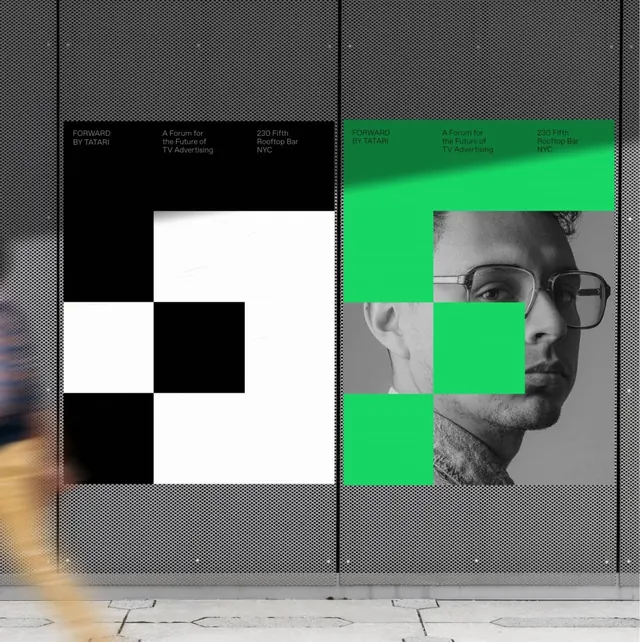
Editorial spread dividing two composition strategies: a stark black-and-white checkerboard pattern on the left, a portrait silkscreened in grayscale and neon green on the right.
Summary
Editorial spread pairing a black-and-white geometric checkerboard abstraction with a vibrant neon-green portrait silkscreen, divided vertically to contrast pure pattern against figurative photography.
Visual description
The left panel is a strict 2x3 black-and-white checkerboard grid. The right panel isolates a neutral-tone close-up portrait of a person wearing glasses, with the gray tones selectively masked and replaced by neon lime green at the eyes, nose, and cheek planes. A thin horizontal line of text and metadata runs along the top of the composition in condensed sans-serif. The overall frame is mounted against a textured gray background visible at the edges, mimicking a printed poster or sheet layout. The contrast between pure abstraction and photographic figuration is the core tension.
Key takeaway
The use of a single neon accent (green) breaking a monochrome grayscale to create focal depth without adding color chaos. The vertical split-screen format forcing a formal comparison between geometry and figure. The severe, ungrouped checkerboard avoiding any attempt at balance or rhythm.
Reuse notes
Effective for editorial covers, poster work, or graphic design portfolios exploring the relationship between abstraction and figuration. Works best when the portrait is sharp and the accent color is fully saturated. The split-screen approach can feel confrontational or clinical; pair it with relaxed typography elsewhere to soften the mood.
More like this




Keep what you find
A free account saves references to boards and can send you a weekly email of picks based on what you save.
To see every result, go Pro.