Preview image. Unlock full-res
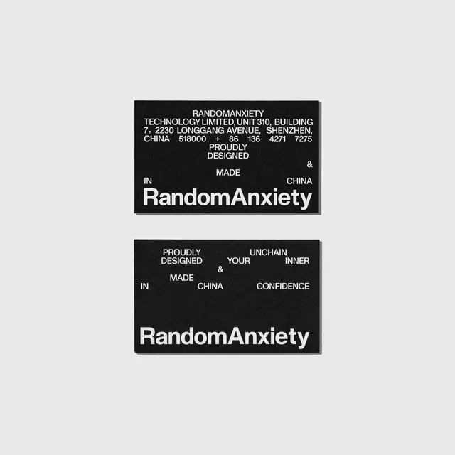
Two black business cards for RandomAnxiety scatter address details and slogan fragments across the field, anchored by an oversized bold lowercase wordmark along the bottom edge.
Summary
Two black business cards photographed on a pale gray ground, both closed by an oversized bold lowercase "RandomAnxiety" wordmark running across the bottom. The defining move is the scattered placement of small all-caps fragments in the upper field versus the heavy logotype that grounds each card.
Visual description
Each card is matte black with white Helvetica-style type. The top card packs a full justified address block at the top (company name, Shenzhen street address, phone number), then breaks into loosely spaced words, "PROUDLY DESIGNED", "MADE", "IN", "CHINA", with a single large ampersand floating top-right. The bottom card drops the address and instead scatters a slogan, "PROUDLY DESIGNED & MADE IN CHINA UNCHAIN YOUR INNER CONFIDENCE", as disconnected words across an open grid. Both cards end with the same large lowercase logotype spanning nearly the full width at the foot.
Key takeaway
The contrast of scale: tiny, almost annotation-sized all-caps fragments scattered loosely across the top half, then one heavy lowercase logotype locking the composition at the bottom. The floating ampersand and word-by-word spacing turns boilerplate copy ("made in China") into a deliberate typographic field.
Reuse notes
Good reference for a stationery or business-card system that wants to feel design-forward without color or imagery. Pairs well with a single grotesque typeface used at two extreme sizes. Caveat: the scattered fragments sacrifice some readability, so reserve this for brands where attitude outranks scannability.
More like this


Keep what you find
A free account saves references to boards and can send you a weekly email of picks based on what you save.
To see every result, go Pro.