Preview image. Unlock full-res
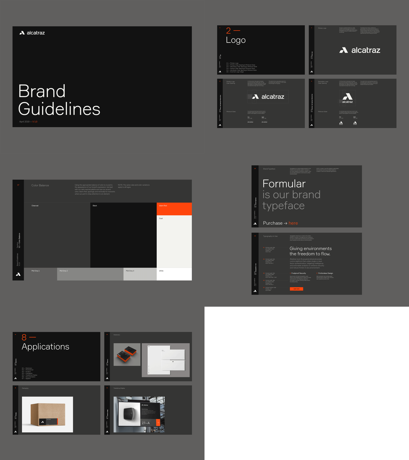
Brand guidelines cover for Alcatraz set on a near-black panel, with a small chevron logo top-left and an oversized two-line grotesque headline anchored bottom-left.
Summary
The title page of a brand guidelines document for "alcatraz", built almost entirely from negative space: a small mark sits top-left and the document title fills the lower third in large type.
Visual description
A near-black rounded rectangle floats on a mid-grey backdrop. In the top-left corner, a small chevron or stylized "A" mark in off-white sits beside the lowercase wordmark "alcatraz". The vast center is left empty. The lower-left quadrant carries the title "Brand Guidelines" set in an off-white grotesque sans-serif, stacked across two lines at large display size with tight leading. Below it, a single small caption line reads "April 2019" followed by a version number "V 1.0" picked out in orange, the only color accent in an otherwise monochrome composition.
Key takeaway
The single orange version number doing all the color work against pure black and off-white. Also the discipline of pushing the title to the bottom-left and leaving the entire upper canvas empty, which reads as confident and premium rather than unfinished.
Reuse notes
A strong template for any cover, title slide, or document front matter where you want gravity and restraint. The lone accent color trick scales to any brand hue. Needs genuinely large type and a real grotesque to carry the emptiness; a timid headline collapses the effect.
More like this


Keep what you find
A free account saves references to boards and can send you a weekly email of picks based on what you save.
To see every result, go Pro.