Preview image. Unlock full-res
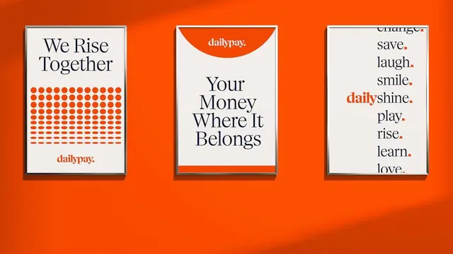
Three silver-framed posters on a bright orange wall present DailyPay slogans in a navy serif, with a dot-halftone grid and a punctuated word list.
Summary
A photographed trio of thin silver-framed posters hung on a bright orange wall, each a cream sheet with navy serif copy and the lowercase "dailypay." wordmark, demonstrating one brand voice three ways.
Visual description
Raking light crosses the saturated orange wall behind three evenly spaced portrait frames. Left: "We Rise Together" in a navy serif above a fading grid of orange dots, halftone-style, with the wordmark bottom-left. Center: "Your Money Where It Belongs" in stacked serif lines, framed top and bottom by orange convex arcs cut into the cream, the brand mark reversed white inside the top arc. Right: a left-aligned column of short words each ending in an orange period (save. laugh. smile. shine. play. rise.) with "daily" set in orange to interrupt one line. Cream, navy and the single orange are the only colors.
Key takeaway
The orange full-stop as a recurring brand device: every line ends in a colored period, turning punctuation into the logo's signature. The convex arc cut from the cream sheet gives a soft "container" shape without adding a new color, and the dot-halftone grid reuses the same brand orange as texture.
Reuse notes
A clean model for a fintech or HR brand system shown as poster collateral: one serif, one accent color, three repeatable layout moves. Pairs a warm primary with calm navy text for friendly-but-credible tone. Caveat: it leans entirely on type and one accent, so the serif choice has to carry real personality.
More like this

Keep what you find
A free account saves references to boards and can send you a weekly email of picks based on what you save.
To see every result, go Pro.