Preview image. Unlock full-res
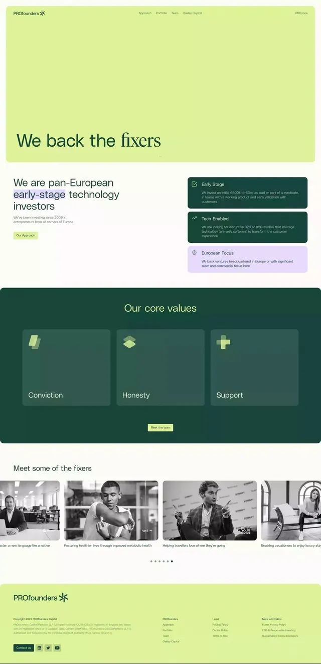
A venture-capital homepage pairing a serif hero headline over a flat lime-green block with forest-green value cards and a black-and-white portfolio carousel.
Summary
A full venture-capital homepage scroll where a large lowercase serif hero headline sits over a flat lime-green panel, followed by forest-green value cards and a black-and-white portfolio carousel. The lime-and-forest pairing, set against off-white, carries the whole identity.
Visual description
The page opens with a tall flat lime-green hero block, a thin top nav, and an asterisk wordmark at left; the oversized hero headline runs in a soft lowercase serif. Below, a two-column intro splits a left text block from a stack of three rounded info cards, two dark forest-green and one pale lavender, each with a small line icon. A full-width dark forest-green section titled "Our core values" holds three translucent cards with subtle layered-square and plus glyphs and short one-word labels, plus a small lime pill button. Further down, a row of black-and-white team or portfolio portraits sits in a peeking carousel with a dot indicator. The footer returns to lime green with the asterisk mark and small social icons. Type mixes the editorial serif headlines with a neutral sans for body and labels.
Key takeaway
The two-tone green system, a punchy lime for attention blocks and a deep forest green for content-dense sections, kept calm by an off-white base. Also the move of running an editorial lowercase serif at hero scale on an otherwise corporate site to read warm rather than stiff, and rendering all portfolio portraits in uniform black and white so a mixed set of headshots feels like one curated family.
Reuse notes
A strong reference for finance, VC, or B2B sites that want to feel human and editorial instead of generic-corporate. The lime-on-forest contrast is the signature; pair the loud lime sparingly (hero, footer, buttons) and let forest green carry the longer reading sections. Duotone portraits are the easy way to unify scrappy founder photos.
More like this

Keep what you find
A free account saves references to boards and can send you a weekly email of picks based on what you save.
To see every result, go Pro.