Preview image. Unlock full-res
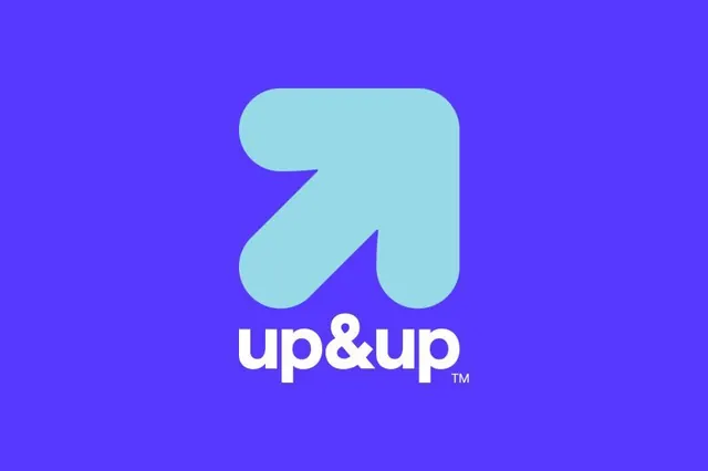
Logo for up&up pairing a thick, rounded upward-right arrow in pale cyan with a lowercase wordmark, centered on a saturated indigo field.
Summary
A centered logo lockup for "up&up": a chunky upward-right pointing arrow with fully rounded corners, rendered in pale cyan on a vivid indigo-purple background, with the wordmark beneath in white.
Visual description
The arrow dominates the upper two-thirds of the frame. It is drawn as a single thick stroke with soft, fully rounded terminals and a generous fillet where the shaft meets the arrowhead, giving it a soft, almost pillowy character rather than a sharp directional point. The fill is a muted light cyan that sits at lower contrast against the saturated purple field. Centered below, the wordmark "up&up" is set in a rounded lowercase white sans-serif with a stylized ampersand, closed off by a small superscript TM. The whole composition is tightly centered with even margins of flat purple around it.
Key takeaway
The arrow earns its optimism from generous corner radii: rounding every joint and terminal converts a generic "growth" arrow into something warm and brand-owned. Holding the mark in a soft cyan one step down in contrast from the white wordmark keeps the symbol from shouting while still reading instantly.
Reuse notes
A clean default for a SaaS, marketing, or B2B brand whose story is momentum or improvement. The pale-cyan-on-purple pairing only holds on the saturated background; on white you would need to invert or recolor the arrow. Pairs well with rounded UI and friendly product copy.