Preview image. Unlock full-res
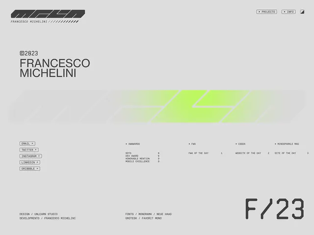
A grid-based portfolio page for designer Francesco Michelini displaying geometric diagonal shapes in lime green, clean sans-serif type, and minimal metadata text in a cool gray palette.
Summary
A grid-based portfolio page for designer Francesco Michelini displaying geometric diagonal shapes in lime green, clean sans-serif type, and minimal metadata text in a cool gray palette.
Visual description
Light gray background dominates. Upper left: a small textured diagonal mark in dark gray with the designer's name and studio, barely noticeable. Center: a series of pale geometric parallelograms in lime green stacked diagonally across the middle, suggesting motion. Top right: navigation buttons (Projects, Info) and small profile icon. Lower section: two columns of structured information - left column lists email, Twitter, LinkedIn, Dribbble handles in small labeled type; right column displays navigation items (Awards, FAQ, CodePen, KindlyPixel.Mag) with numeric references. Bottom right: a large geometric "F/23" monogram serves as secondary mark. All elements precisely aligned to invisible grid; ample negative space throughout.
Key takeaway
The accent color restraint: a single lime green punctuates a neutral gray-white palette without vibrant competing for attention. Diagonal geometry creates motion and visual interest without ornamentation. The typography hierarchy uses scale, weight, and color sparingly to guide scanning: the name and large monogram are anchors, metadata is deferential. Negative space and geometric rhythm replace photographic imagery and flourish.
Reuse notes
Template for minimal design agency or independent designer portfolios that prize restraint and type legibility over decoration. The diagonal accent works across screen and print contexts. Best paired with photography or project grids elsewhere on the site, as the type page itself avoids imagery. The metadata organization (contacts, links, references) is efficient for designer CVs or about pages.
More like this






Keep what you find
A free account saves references to boards and can send you a weekly email of picks based on what you save.
To see every result, go Pro.