Preview image. Unlock full-res
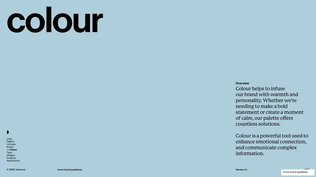
Full-bleed pale-blue section divider with an oversized lowercase "colour" wordmark top-left and a serif-set overview paragraph bottom-right, opening the colour chapter.
Summary
The colour chapter divider: a full-bleed pale-blue field with a single oversized lowercase "colour" top-left and a short serif-set overview paragraph anchored bottom-right.
Visual description
Like the avatar divider, the slide goes full-bleed pale blue (#B9D3DC) and drops the cream sidebar. "colour" is set very large in black lowercase Neue Haas Grotesk, anchored top-left. In the lower-right, a small bold "Overview" label heads two short paragraphs set in a serif face (the brand's secondary typeface), describing colour as a tool for warmth, bold statements, calm, emotional connection, and communicating complex information. The persistent black furniture sits small at the lower-left and bottom: the half-circle glyph, the navigation list (Colour bolded with an arrow), and the footer "© 2022 hcma.ca", "hcma brand guidelines", "Version 01".
Key takeaway
The section divider that does double duty: the same big-lowercase-word-on-a-colour-field template as the avatar opener, but here it also seeds a short serif intro in the corner, mixing the sans display word with the secondary serif voice. That sans/serif pairing previews the type system while keeping the divider calm and consistent.
Reuse notes
A reusable chapter opener for sections that benefit from a short framing paragraph (colour, voice, imagery). The corner-set serif overview is an easy add to the basic divider template. Keep the background colour consistent with the deck's other dividers so they read as a set. Depends on a serif secondary face to land the type contrast; without one, drop the paragraph or set it in the sans.
From this deck: Colour section opener
View deck