Preview image. Unlock full-res
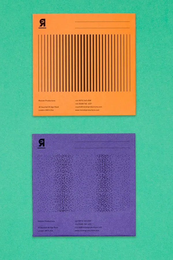
Two square stationery cards for Restate Productions, one orange and one purple, each carrying a reversed-R monogram and a distinct line-and-dot pattern, shot on a green ground.
Summary
Two square stationery pieces for Restate Productions, an orange one and a purple one, that share a reversed-R monogram and contact block but carry different fill patterns: vertical bars on the orange, a scattered dot field on the purple.
Visual description
Two flat square cards lie on a saturated mint-green surface, the orange above the purple, both slightly rotated. Each prints in black only. The top-left corner holds a bold reversed capital R as the mark, with a ruled signature line to its right. The orange card centers a block of evenly spaced vertical lines that read like a barcode; the purple card centers a loosely scattered halftone dot field in roughly the same footprint. A small three-line address and contact block sits at the lower left of each, with phone, email, and web details set in a tight monospaced face.
Key takeaway
Holding the layout, monogram, and contact block constant while swapping only the central pattern and base color gives a system that reads as one identity across many pieces. Treating the fill area as a changeable texture slot, bars versus dots, lets a minimal black-on-color scheme stay varied without new typography.
Reuse notes
A clean model for a stationery or collateral system that needs visible variety across cards, envelopes, or covers from a small kit of parts. The high-chroma color-on-color pairing pops in photography; print on uncoated stock to keep the flat matte look. Confirm the monogram reads as intentional, since a reversed letter can look like an error out of context.