Preview image. Unlock full-res
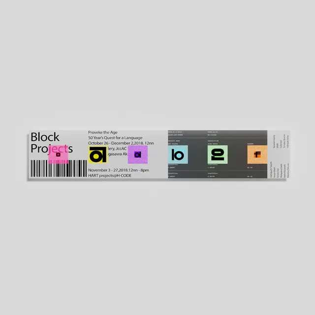
A horizontal ticket-style identity for 'Block Projects' uniting event metadata, barcode, colored logo glyphs, and a dark spec strip in one modular band.
Summary
A horizontal band artifact treating event logistics as a printable admission ticket, anchored by a barcode on the left, flanked by centered event copy and modular colored-square logo glyphs, with a dark tabular spec sheet on the right.
Visual description
The layout is a wide rectangular strip on pale gray. The left third holds a stacked sans-serif wordmark "Block Projects" in black above a vertical barcode. The center carries small-caps event text flush-left ("Provoke the Age", date range, venue, ticketing code) in tight lines. Interspersed with and framing the text are five small rounded squares in vibrant magenta, lilac, teal, sage green, and orange, each housing a single black capital letter (b, l, o, e, f) that spell the brand in glyph form. The right third shifts abruptly to a dark charcoal background printed with rows of tiny tabular fine print—credits, metadata, technical specs—creating a strong light-dark compositional split that echoes the visual language of a real event ticket or boarding pass.
Key takeaway
Formatting identity and event info as a physical ticket (complete with barcode) gives dense factual copy a designed, intentional quality rather than an information-dumped feel. The colored square glyph set solves the problem of a multi-word mark: one consistent rounded tile, recolored per letter, becomes both a wordmark and an icon system that can be deployed flexibly across touchpoints.
Reuse notes
Strong reference for festival, exhibition, hackathon, or conference identities that require legible event details and ticketing information. The barcode and tabular spec panel signal technical credibility and precision; the colored glyphs provide visual warmth and memorability. Works best when the palette is bold and limited, so the tiles stay the loudest graphic element.
More like this






Keep what you find
A free account saves references to boards and can send you a weekly email of picks based on what you save.
To see every result, go Pro.