Preview image. Unlock full-res
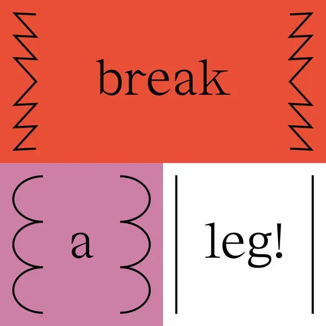
A three-panel typographic poster spelling \"break a leg!\" in black serif across red, mauve, and white blocks, each framed by a different hand-drawn line motif.
Summary
A square typographic poster that breaks the phrase "break a leg!" across three color blocks, pairing a black serif face with a different hand-drawn line motif inside each panel.
Visual description
The square splits into a wide top band and two lower cells. The top is tomato red with "break" set large in a black serif, flanked left and right by tall zigzag lines drawn freehand. Bottom-left is a mauve-pink cell holding a lowercase "a," bracketed by two oversized curly-brace shapes that bulge inward. Bottom-right is white with "leg!" between two thin vertical rules. Each word sits centered in its field, and the line motifs act as improvised quotation marks or frames around the type.
Key takeaway
Using a different decorative line motif (zigzag, brace, vertical rule) per panel to frame the same serif type, so one phrase reads as three distinct moments. The color blocks carry the rhythm while the black type stays constant.
Reuse notes
Good for playful editorial covers, event or theatre promo, or a brand moodboard page demonstrating type-plus-ornament pairings. The freehand motifs keep it from feeling rigidly Swiss; swap the phrase and palette to retarget.
More like this
Keep what you find
A free account saves references to boards and can send you a weekly email of picks based on what you save.
To see every result, go Pro.