Preview image. Unlock full-res
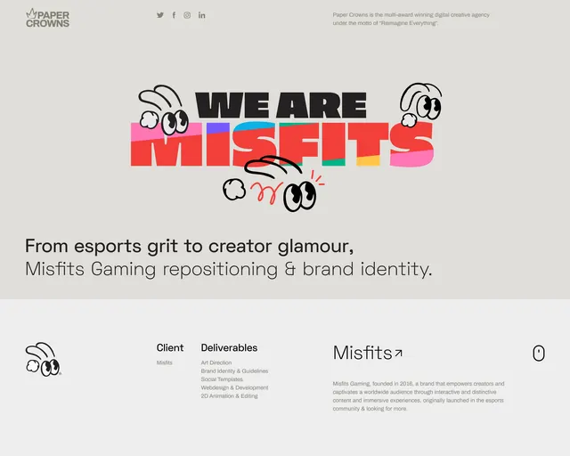
Creative agency case-study hero for an esports rebrand, split-tone headline in black and hot red with hand-drawn cartoon-eye doodles overlaid on a warm grey field.
Summary
A creative agency case-study opener for an esports rebrand, with a stacked headline where "WE ARE" sits in solid black and "MISFITS" explodes in hot red with a hidden multicolor layer glimpsed through the letterforms, framed by loose hand-drawn doodles.
Visual description
Warm light-grey background. Header bar holds the agency logo (Paper Crowns) at left, social-media icons center, and a short grey intro line at right. Center stage: a heavy condensed all-caps sans-serif headline stacked on two lines. First line "WE ARE" in solid black; second line "MISFITS" in bright fire-engine red with a thin multicolor accent (green, yellow, pink) barely visible behind and peeking through counter spaces. Loose black marker doodles of oversized cartoon googly eyes scatter across and overlap the letterforms, plus a single red squiggle accent. Below the headline, a two-line subhead in smaller dark-grey type frames the project scope. Footer band in slightly lighter grey holds a small doodle mark, two-column layout (Client + Deliverables lists in small grey sans), a "Misfits" arrow link, descriptive body text, and a small mouse-scroll icon at far right.
Key takeaway
Splitting a single headline across two typographic registers—disciplined black on one line, high-energy color on the next—creates visual contrast without adding elements. The hidden multicolor layer peeking through the red letters' negative space adds depth and surprise without overtaking the design. Hand-drawn doodle eyes overlapping crisp typography introduce playful irreverence while the doodles stay loosely positioned so they enhance rather than tangle the grid.
Reuse notes
Effective template for creative-agency project pages, rebrand case studies, or youth/gaming brands where personality matters. The doodle layer must remain sparse; over-application tips into clutter. Works best on a neutral ground (warm grey works well) so the hot red and animated doodles carry the full energy. The split headline technique scales to any number of single-word phases as long as the color contrast is strong.
More like this

Keep what you find
A free account saves references to boards and can send you a weekly email of picks based on what you save.
To see every result, go Pro.