Preview image. Unlock full-res
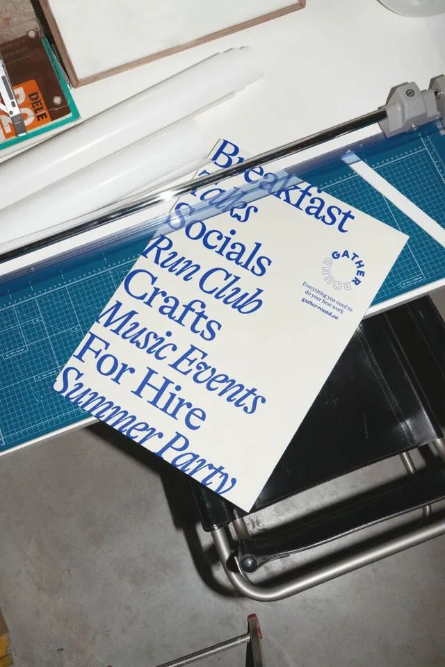
A cream A-format poster of stacked community activities (Breakfast, Talks, Socials, Run Club, Crafts, Music Events, For Hire, Summer Party) set in oversized cobalt-blue serif type, photographed in a print studio on a paper guillotine.
Summary
A printed activity roster for "Gather Round" expressed as a single left-aligned column of oversized cobalt-blue serif headlines—one word per line, full-bleed to the left margin—with a small circular lockup and italic subtext top-right, shot in-context on printing studio equipment.
Visual description
Two posters lie at an angle on a turquoise self-healing cutting mat and a steel paper guillotine, with a Bauhaus leather-and-steel chair and concrete floor visible beyond. The top poster's cream paper fills the frame. Eight activity names (Breakfast, Talks, Socials, Run Club, Crafts, Music Events, For Hire, Summer Party) run left-aligned in a high-contrast serif face—transitional, generous in weight and x-height—scaled large enough that the longest words stretch nearly edge-to-edge. Each word occupies its own line. Top-right, a small circular brand lockup combines a serif "C" and two lines of italic sub-text (likely contact or web info) in the same cobalt blue. The cool palette of cream, cobalt, gray-brown studio surroundings, and stainless steel creates an understated, craft-adjacent atmosphere. A second identical print peeks from behind, implying a series or edition.
Key takeaway
Using a single oversized serif to carry the entire layout—no supporting graphics, no color blocks, no image—elevates plain text to poster status. Left alignment with full-bleed creates an asymmetric energy that invites the eye to move downward through the list. Documenting the finished print in an actual studio context (cutting mat, trimmer, furniture) rather than flat-laying it on a white background communicates authenticity and craft.
Reuse notes
Strong reference for community organizations, studios, studios, event spaces, or cultural institutions with straightforward messaging needs. The display serif must be genuinely excellent—generic or screen-optimized faces flatten the effect. Pairs well with minimal color (one accent tone on cream or off-white); in-context photography suits social media, portfolios, and case studies better than flat mockups.
More like this


Keep what you find
A free account saves references to boards and can send you a weekly email of picks based on what you save.
To see every result, go Pro.