Preview image. Unlock full-res
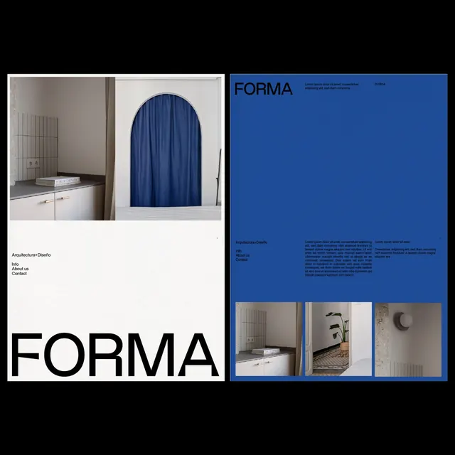
A minimalist design studio branding system using stark black and white typography, cobalt blue accents, and paired architectural photography across a two-page editorial layout.
Summary
A design studio branding system balancing clean, oversized black sans-serif wordmark on a white left page with cobalt blue and photography on the right, using layered typography and a three-image grid to show work.
Visual description
Left page: cream/off-white background with "Arquitectura+Diseno" in small sans-serif and navigation links, anchored by a massive black "FORMA" logotype filling the lower third. Two architectural photographs occupy the top (white kitchen drawer with closed shelving, blue velvet-draped arched doorway). Right page: solid cobalt background with "FORMA" repeated in smaller blue type at top-right, metadata and body text in smaller serif and sans-serif, and a three-column grid of architectural photos at the bottom. Layout emphasizes asymmetry and negative space; cobalt anchors the composition while monochromatic photography grounds the design system.
Key takeaway
The restraint of a two-color system (black and blue) with generous white space. Type size contrast drives hierarchy without decoration. The photographs are allowed to breathe on the left page, then serve as a modular grid on the right, showing how a single asset type can have multiple roles in a system. The cobalt blue is used structurally, not decoratively.
Reuse notes
Ideal for architecture, design, or boutique agency branding seeking to appear curated and professional. The photography-led approach works only if your visual content is strong. The layout assumes extended page space (not mobile); best for print, portfolios, or large-format web presentations. A design studio guide in the truest sense: what it shows tells you how to work.
More like this



Keep what you find
A free account saves references to boards and can send you a weekly email of picks based on what you save.
To see every result, go Pro.