Preview image. Unlock full-res
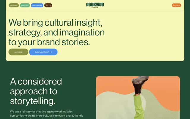
A creative-agency homepage pairing a butter-yellow hero of bold sans headline and pill nav with a forest-green section below carrying an orange-bordered photo of a stepping foot.
Summary
A creative-agency landing page that stacks a rounded butter-yellow hero block over a deep forest-green section, joined by olive-green and orange pill buttons. The defining move is the warm two-tone color-block layout with a compressed condensed logotype and an orange-edged lifestyle photo cropped to a wavy frame.
Visual description
The top hero is a large rounded rectangle in pale butter yellow. Across its top sits a centered, heavily compressed condensed logotype reading "FourTwo Creative," flanked by a small cluster of colored pill nav links on the left and a single orange "inspire" pill on the right. The headline below runs three short lines of bold dark-green sans serif: "We bring cultural insight, strategy, and imagination to your brand stories." Two pill CTAs follow, one olive "services" and one blue "build your brief" with an arrow. Beneath the hero, the page background turns deep forest green; a second headline "A considered approach to storytelling" appears in white display sans with a paragraph of muted body copy. To its right, a photograph of a boot stepping forward over green and cream organic shapes is set against an orange panel and cropped with a soft wavy top edge.
Key takeaway
Stacking a light rounded hero card directly on a saturated dark section gives instant structure and a strong scroll moment without any divider. Color-coding the pill nav and CTAs (olive, blue, orange) turns navigation into a brand accent rather than plain links. The wavy-edged photo crop against a flat orange panel keeps imagery playful and on-brand instead of a hard rectangle.
Reuse notes
A solid template for a creative or marketing agency that wants warmth and personality while still reading professional. The butter-yellow over forest-green pairing with an orange accent is the takeaway palette, easy to lift onto a homepage or pitch deck. Pairs well with a compressed display logotype and a softer sans for body. Caveat: the many pill shapes and three accent colors can tip toward busy, so keep type and spacing disciplined to balance it.
More like this

Keep what you find
A free account saves references to boards and can send you a weekly email of picks based on what you save.
To see every result, go Pro.