Preview image. Unlock full-res
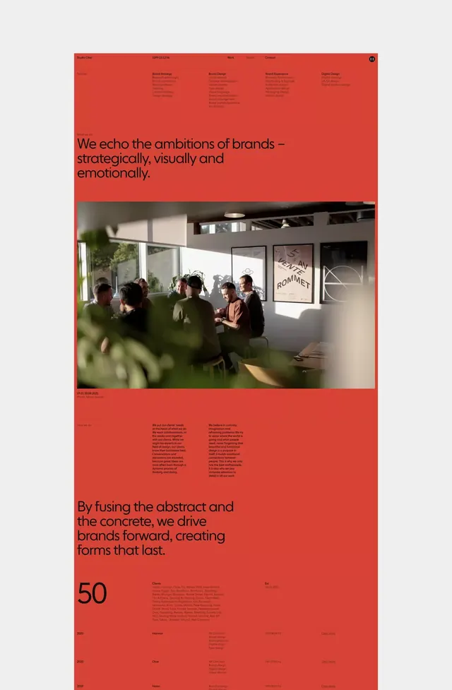
A long-scroll agency homepage on a saturated burnt-orange field, with black grotesque headlines, a tonal service grid, and a single warm studio photograph.
Summary
A full-bleed burnt-orange agency homepage (Studio Oker) that lets one saturated color carry the whole identity, with black headlines and tone-on-tone supporting text. The defining move is the monochrome color field broken only by a single warm studio photo.
Visual description
The entire page sits on a saturated burnt-orange/red ground framed by thin light-gray browser margins. A slim top bar holds the studio name, a running counter, and Work / Studio / Contact links. Below, a four-column service index (Brand Strategy, Brand Design, Brand Experience, Digital Design) is set in small black type that drops to a darker tone-on-tone for sub-items, so hierarchy comes from value not size. A large black grotesque statement, "We echo the ambitions of brands, strategically, visually and emotionally," anchors the upper third. The one photograph, a sunlit studio table of people in conversation behind out-of-focus foliage, is the sole image and warms the flat field. Further down, a second oversized headline and a giant numeral "50" with a dense client list and a 2020-2019 case-study table continue the all-orange scroll.
Key takeaway
Committing to one loud color across the entire page and creating hierarchy through type value (black to tonal orange) instead of multiple hues or panels. The oversized numeral and the single warm photo are the only relief, which makes both land harder.
Reuse notes
A confident template for design studios and creative agencies wanting personality without a busy palette. Requires a color strong enough to hold an entire scroll and copy disciplined enough to live in one or two tones. One excellent photograph is doing heavy lifting; weak imagery would collapse it.
More like this




Keep what you find
A free account saves references to boards and can send you a weekly email of picks based on what you save.
To see every result, go Pro.