Preview image. Unlock full-res
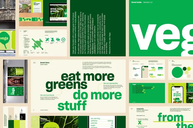
A brand-guideline overview laid out as a grid of page thumbnails for a plant-based brand, built on deep green, bright green, and warm cream with a heavy lowercase wordmark.
Summary
An overview spread of a "Vega" brand guideline, shown as a tiled grid of page thumbnails. The system runs on deep forest green, bright leaf green, and warm cream, with a chunky lowercase wordmark.
Visual description
Roughly a dozen guideline pages are arranged in a tight grid against a cream ground. Pages alternate between dark-green fields with cream copy and cream fields with green copy, holding the two-tone identity together. Recurring contents are legible at thumbnail scale: a full-bleed "veg" wordmark in heavy lowercase sans, a "Brand Voice" overview, an expressive oversized headline ("eat more greens / do more stuff"), a logo-construction page numbering the mark's parts, a typography spec with a large "X" baseline diagram, and a per-serving nutrition table. Bright green dots and leaf imagery recur as accents. Photography appears in a few cells, including produce and lifestyle shots, but type and color blocking dominate.
Key takeaway
The disciplined two-green-plus-cream palette doing all the work: swapping background and text colors page to page keeps a long deck cohesive without extra hues. The oversized lowercase headlines give a wellness brand energy and warmth while the logo-construction and type-spec pages keep it rigorous.
Reuse notes
A solid reference when assembling a guideline deck for a food, wellness, or sustainability brand and you want to preview the whole system at a glance. Reach for it to argue for a tight palette and a flexible headline voice rather than a fixed lockup. The bright green needs the cream and dark green around it to stay appetizing rather than harsh.
More like this


Keep what you find
A free account saves references to boards and can send you a weekly email of picks based on what you save.
To see every result, go Pro.