Preview image. Unlock full-res
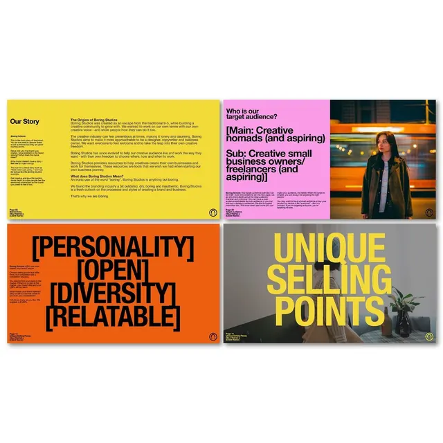
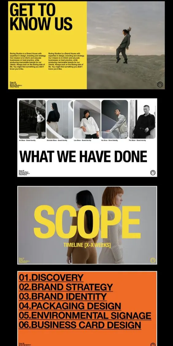
A four-panel brand identity system using bold color blocking, large-scale sans-serif headlines, and asymmetrical grid layout to convey creative confidence.
Summary
A four-panel brand identity system using bold color blocking, large-scale sans-serif headlines, and asymmetrical grid layout to convey creative confidence.
Visual description
Four equal panels arranged in a 2x2 grid showing distinct brand sections: top-left a vibrant yellow panel with "Our Story" in bold black type alongside smaller body text; top-right a hot pink panel with white sans-serif headlines and a portrait photograph cropped on the right edge; bottom-left an orange panel with black all-caps text reading "[PERSONALITY] [OPEN] [DIVERSITY] [RELATABLE]"; bottom-right a gray panel with large yellow all-caps "UNIQUE SELLING POINTS" and a lower photograph. Headlines and body copy use consistent clean sans-serif throughout. Each panel is visually distinct through color and layout while maintaining typographic unity across the system.
Key takeaway
The disciplined use of color as primary information hierarchy, with each panel color-coded to a distinct brand message. The contrast between large display typography and reserved body text creates readable depth. The asymmetrical photograph placement within otherwise orderly typography anchors the layout with a human element.
Reuse notes
Effective for agency pitches, corporate identity systems, or marketing materials where you need to communicate multiple brand values at once. Works well for B2B and startup positioning. Avoid using lighter backgrounds if legibility of all-caps sans-serif headlines is a concern.
More like this


Keep what you find
A free account saves references to boards and can send you a weekly email of picks based on what you save.
To see every result, go Pro.