Preview image. Unlock full-res
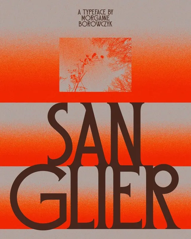
Bold display typeface centered over a warm orange-to-terracotta gradient with an embedded nature photograph, creating a textured yet striking typographic specimen.
Summary
A typeface specimen for Sangler, a bold display sans-serif, set against stacked bands of warm orange-to-terracotta gradient with a photographic landscape embedded centrally, bridging type and organic imagery.
Visual description
A centered composition with three horizontal color bands: a gray zone at the top (containing small text "A TYPEFACE BY MORGANE BOROWCZYK"), a vivid orange band with an inset photograph of leafless tree branches, and a softer gradient band at the bottom. The word "SANGLER" is rendered in a large, geometric sans-serif with generous letter spacing, split across two lines in dark brown, positioned to straddle the middle band. The typeface is tightly kerned and modern, with minimal serifs. The overall palette shifts from warm muted terracotta on the edges to a more saturated orange in the central band, creating visual depth.
Key takeaway
The restrained use of a single organic photograph (tree branches) as a texture element within a bold type composition, neither competing with nor overwhelming the letterforms. The stacked horizontal bands create clear hierarchy without needing additional design elements. The warm color story (orange, terracotta, brown) feels editorial and cohesive.
Reuse notes
Effective for typeface showcases, editorial book covers, and magazines seeking warmth alongside contemporary sans-serif type. The embedded photography works well in print or high-resolution digital contexts. Avoid on small screens where the photograph detail will be lost.
More like this



Keep what you find
A free account saves references to boards and can send you a weekly email of picks based on what you save.
To see every result, go Pro.