Preview image. Unlock full-res
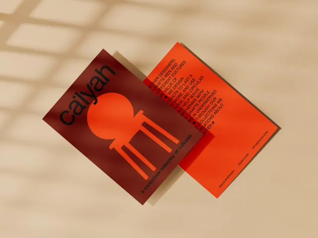
Two diagonally overlapped business cards in earthy brown and orange with sans-serif typography and a radial sun icon.
Summary
Two diagonally overlapped business cards in deep maroon and bright orange, each with a simple radial sun icon and sans-serif text, casting a subtle shadow on a warm neutral surface.
Visual description
Two rectangular cards overlap at a diagonal angle: the front card is bright burnt orange with a radial/sun icon in deep maroon; the back card is dark maroon with the same icon in orange. Both cards contain sans-serif sans letterforms positioned upper left. A subtle shadow beneath the cards suggests depth and 3D rotation. The warm earthy palette (maroon, bright orange, cream-beige substrate) creates an artisanal, grounded aesthetic. The use of inverse color (icon color swapped between cards) creates visual cohesion despite the opposing hues.
Key takeaway
The diagonal overlapping composition to suggest playful movement while maintaining hierarchy. The inverse color-treatment of the same icon across two materials (one icon flipped in palette) as a unifying brand device. Warm-earth-tone pairing (maroon and orange) that feels contemporary and organic rather than flat.
Reuse notes
Excellent for cultural organizations, artisanal food/craft brands, or design studios. The geometric sun icon is memorable at all scales. The color pairing avoids corporate flatness; works in both digital and print applications.
More like this


Keep what you find
A free account saves references to boards and can send you a weekly email of picks based on what you save.
To see every result, go Pro.