Preview image. Unlock full-res
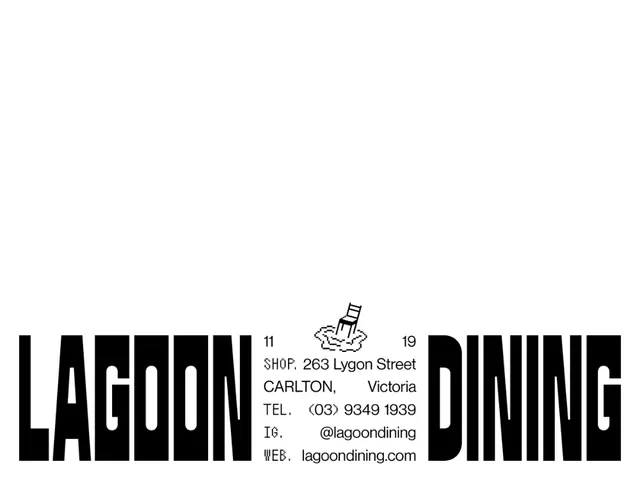
A restaurant identity that splits a giant condensed LAGOON / DINING wordmark to the far edges and drops the address block plus a pixel-style chair-in-water mark into the gap between.
Summary
A "Lagoon Dining" restaurant lockup that pushes the two words of the name hard to the left and right edges in a giant condensed black sans, leaving a center channel for the full contact block and a tiny pixel-drawn chair sitting in rippling water.
Visual description
Black on white. "LAGOON" is bottom-anchored at the left edge and "DINING" at the right edge, both in a very tall, heavy condensed grotesque that bleeds off the baseline. The negative space between them holds a left-aligned information block: the numerals "11" and "19" as bookends, then SHOP, address (263 Lygon Street, Carlton, Victoria), TEL, IG, and WEB lines. The labels (SHOP, TEL, IG, WEB) are set in a quirky monospaced pixel face while the values stay in a clean sans. Above the address sits a small low-resolution pixel illustration of a chair half-submerged in concentric water ripples, the brand's wink.
Key takeaway
Splitting a two-word name to the opposite edges and treating the empty middle as the real estate for everything practical (hours, address, socials). It makes the name the frame and the details the content. The pixel-art labels and chair icon add one note of personality to an otherwise stark layout without breaking the discipline.
Reuse notes
Good for a hospitality or venue identity, a poster, a business card back, or a website footer where you have a two-word name and a block of contact info to place. The edge-anchored type needs a wide format to breathe; it collapses on narrow mobile. The monospaced-label trick reads as deliberately crafted, not default, so keep it consistent across touchpoints.